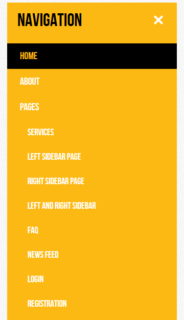
If you ever wondered how you can toggle the visibility of sub-menu items of RSJoomla! templates, here's how.
This scenario can be achieved in a couple of ways (e.g. template override for the menu module), however, this tutorial covers a way to add this functionality through CSS and Javascript (jQuery). Note that although this tutorial was created using RSJuno!, the same principle can be applied to all the templates (with some fixes). Basically, we are going to use the custom.css and custom.js files of the templates to create a button and add functionality.
How To
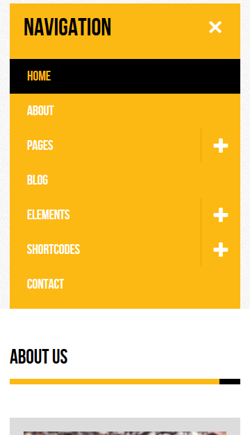
To get things started, we will use jQuery to add the button to the menu items that are parents
Open your custom.js file and add the following snippet:
// we wait until the document is ready
jQuery(document).ready(function($){

  // find the list items that are parents and for each, add the + button
  // does not matter window width, we handle the visibility of the button through media queries
  $('.nav.menu').find('.parent').each(function(){
    // we create a simple <a> tag that has a plus icon as content
    $(this).prepend('<a href="#" class="sub-menu-opener"> <span class="icon-plus"> </span> </a>')
  });

});

Although we have added a button to the menu items, we will need to style it through CSS. In your custom.css files, add the following styles
/* Breakpoint to show/hide the mobile navbar is 980 */
@media (max-width: 979px) {
  /*
    We hide the sub-menu items here
    Note that depending on the template, this class might change
  */
  .rstpl-main-menu-position .navbar .nav .dropdown-menu, .rstpl-main-menu-full-width-position .navbar .nav .dropdown-menu {
    display: none !important;
  }
  .rstpl-main-menu-position .navbar .nav .dropdown-menu.opened, .rstpl-main-menu-full-width-position .navbar .nav .dropdown-menu.opened {
    display: block !important;
  }
  /*
    We will position the newly created button in the right side of the menu item
    Note that depending on the template, you might want to change the style of this button
  */
  .navbar .nav > li .sub-menu-opener {
    position: absolute;
    right: 0;
    top: 0;
    max-height: 50px;
    display: inline-block;
    text-align: center;
    border-left: 1px solid rgba(0, 0, 0, 0.1);
    padding: 15px;
  }
  /*
    we add some transition effects so we get some sort of feedback on click
  */
  .navbar .nav > li .sub-menu-opener > .icon-plus {
    transition: all 0.2s ease-in-out;
    -webkit-transform: rotate(0deg);
    -ms-transform: rotate(0deg);
    transform: rotate(0deg);
  }
  /*
    when the item is clicked, the + will rotate 45 degrees
  */
  .navbar .nav > li .sub-menu-opener.opened > .icon-plus {
    transition: all 0.2s ease-in-out;
    -webkit-transform: rotate(45deg);
    -ms-transform: rotate(45deg);
    transform: rotate(45deg);
  }
}
  /*
    when the normal navbar is displayed, the link is not visible
  */
@media (min-width: 980px) {
  .navbar .nav > li .sub-menu-opener {
    display: none;
  }
}
Now that we have added the button, styled it, we need to add functionality. Open the custom.js file and insert the following script inside the document ready function.
  // on clicking the button, find the dropdown menu (which should be a sibling of the anchor) and open it
  $('.sub-menu-opener').click(function(event){
    event.preventDefault();
    $(this).toggleClass('opened');
    $(this).siblings('.dropdown-menu').slideToggle();
  });
If you followed the above instructions, your custom.js should look like this:
// we wait until the document is ready
jQuery(document).ready(function($){  // find the list items that are parents and for each, add the + button

  // does not matter window width, we handle the visibility of the button through media queries
  $('.nav.menu').find('.parent').each(function(){
    // we create a simple <a> tag that has a plus icon as content
    $(this).prepend('<a href="#" class="sub-menu-opener"> <span class="icon-plus"> </span> </a>')
  });  // on clicking the button, find the dropdown menu (which should be a sibling of the anchor) and open it

  $('.sub-menu-opener').click(function(event){
    event.preventDefault();
    $(this).toggleClass('opened');
  $(this).siblings('.dropdown-menu').toggleClass('opened');
  });});
Disable or hide menu navigation in mobile
Hello, I use your perfect template rsjuno responsive and I want to disable or hide it for mobile devices.
QuoteHow can I do this?
Is there a solution?
Thank you
Initial State
Hello Walter,
QuoteThe initial state sometimes is "off" due to a secondary script that is loaded by the template (head over to Template Options and set Animate Main Menu to No).
Although you can fix this from the source code, I wouldn't recommend it - setting this option to No does not modify the User's Experience that much.
As for your other question, regarding the MINUS sign instead of the +. Please keep in mind that due to the fact that we're not modifying the source code or creating template overrides for the main menu, we need to rely solely on Javascript and I didn't want to "bloat" it with unnecessary lines of code.
Regards!
Mobile friendly navigation with sub-menu opening button
Thank you for this helpful tutorial.
QuoteI have tested it with RSJuno and RSPenta. It turns out that the initial state is not always exact. Sometimes - after the first call of mobile-menu - the submenus already expanded, though still the plus-sign is displayed. Only after pressed twice it is correct: Plus-sign = collapsed, X-sign = collapsed.
I have a suggestion: It would be clearer if, instead of an "X" a Minus-sign would appear to collapse the submenu.
Kind regards