
General Configuration tabs
All of the RSSocial!'s configuration options are found in the website's administration area. To set up the module, head to the following path:
Extensions >> Module Manager >> look for RSSocial! and edit it.
The parameters are grouped in multiple tabs, based on relevance. We've identified 2 types of tabs: those that regard social networking (Facebook, Google+, etc.) options, and those that regard the module's general configuration (Appearance, Advanced, etc.). In this article we will describe the general configuration tabs:
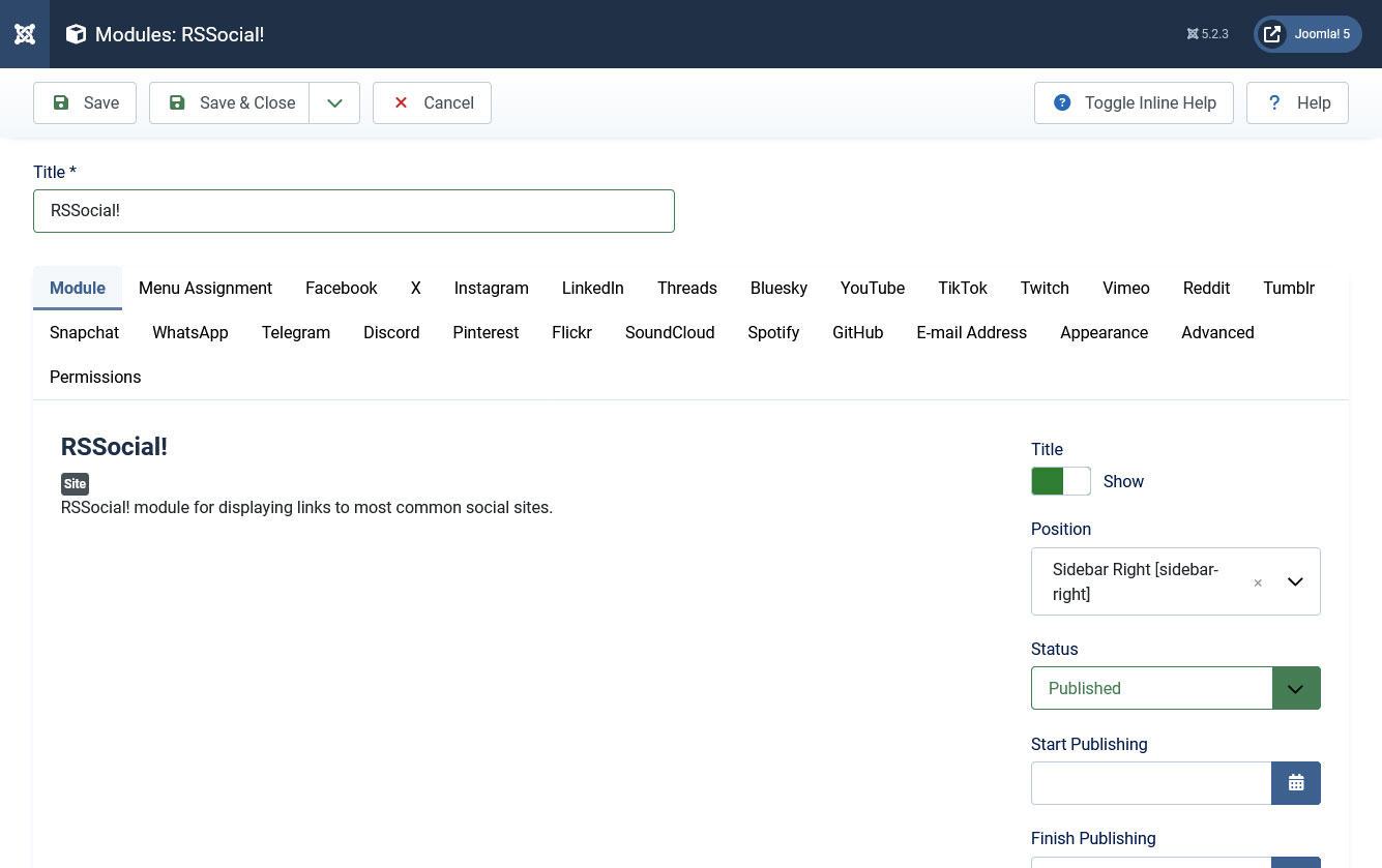
Module
- Show Title: Yes / No - show / hide the module's title
- Position: Select one of the available module positions to have the module displayed in
- Status: Published / Unpublished - set the module's state
- Start Publishing: select a date to start publishing the module from
- Finish Publishing: select a date to stop publishing the module from
- Access: set an access level (selectable from the default Joomla! access levels)
- Ordering: Set an ordering among the other modules that you are using on the same position (options will be available after choosing a new position and clicking on Save)
- Language: Show the module only for the language selected here (select All for all languages)
- Note: Add some notes that will be displayed in the backend module listing
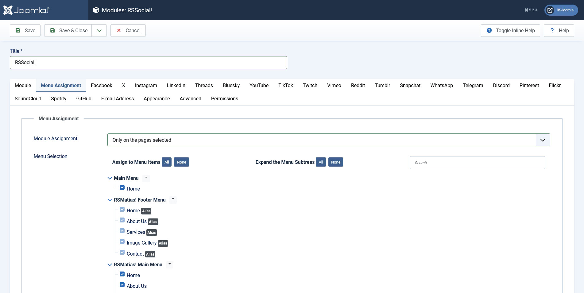
Menu Assignment
Module Assignment: On all pages / No pages / Only on the pages selected / On all pages except those selected - choose on which pages to have the module displayed
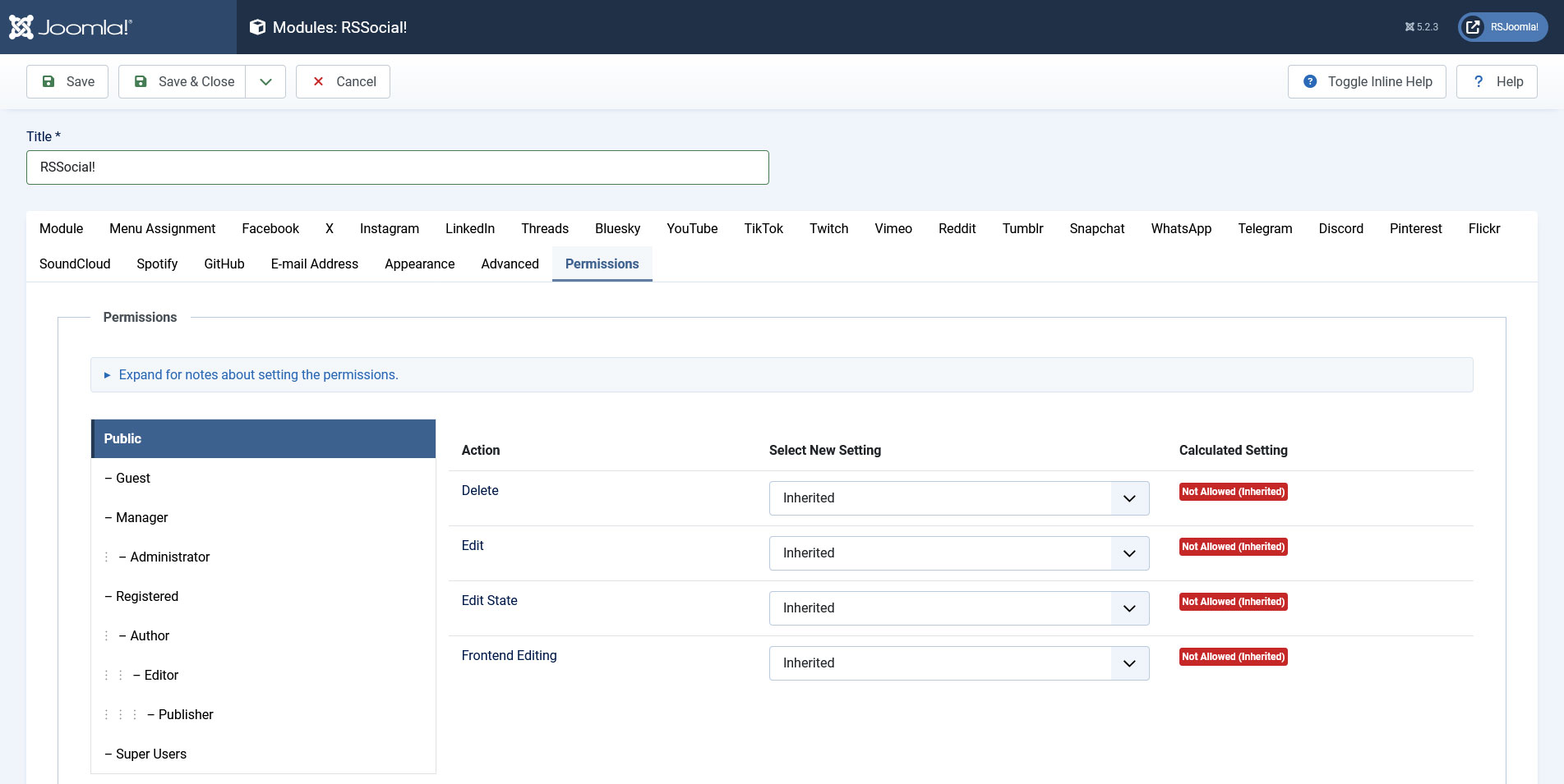
Module Permissions
Here you can find a listing of 3 actions that can be performed. You an set, for each Joomla! group, the permissions that are associated with each action: Allowed, Denied or Inherited. The actions are as follows:
- Delete: users in the group are allowed to delete content
- Edit: users in the group are allowed to edit content
- Edit State: users in the group are allowed to change the extension's content state (publish / unpublish)
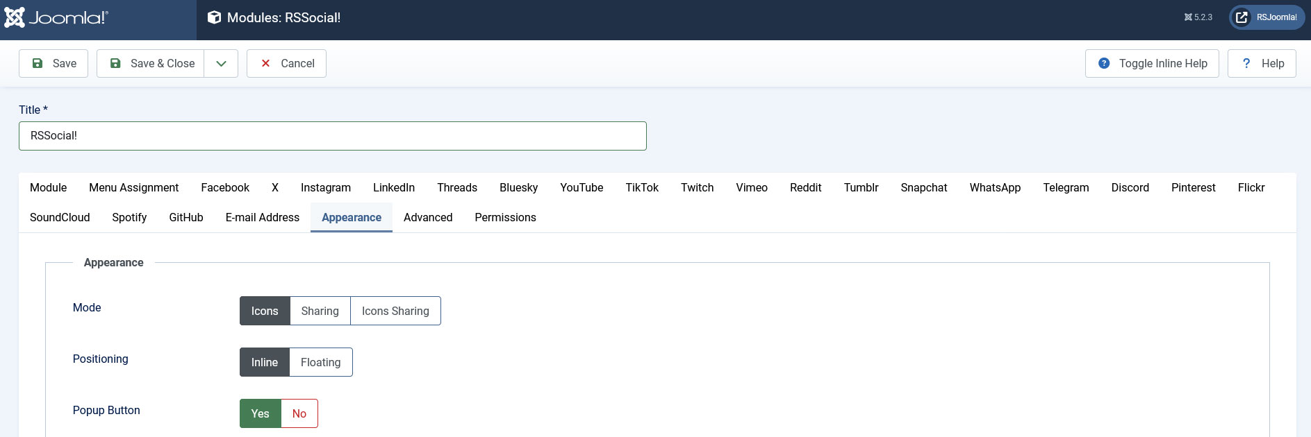
Appearance
- Mode: Icons / Sharing / Icons Sharing - choose how to have the social links displayed - either as icons or using their specific buttons (for example the Facebook Like and Share buttons)
- Positioning: Inline (display the module inside the chosen position) / Floating (float the module to the Left / Top / Right or Bottom of the page, depending on the setting made in the Float field, explained below)
- Popup Button: Display a single button which when clicked, it will expand revealing the configured social icons.
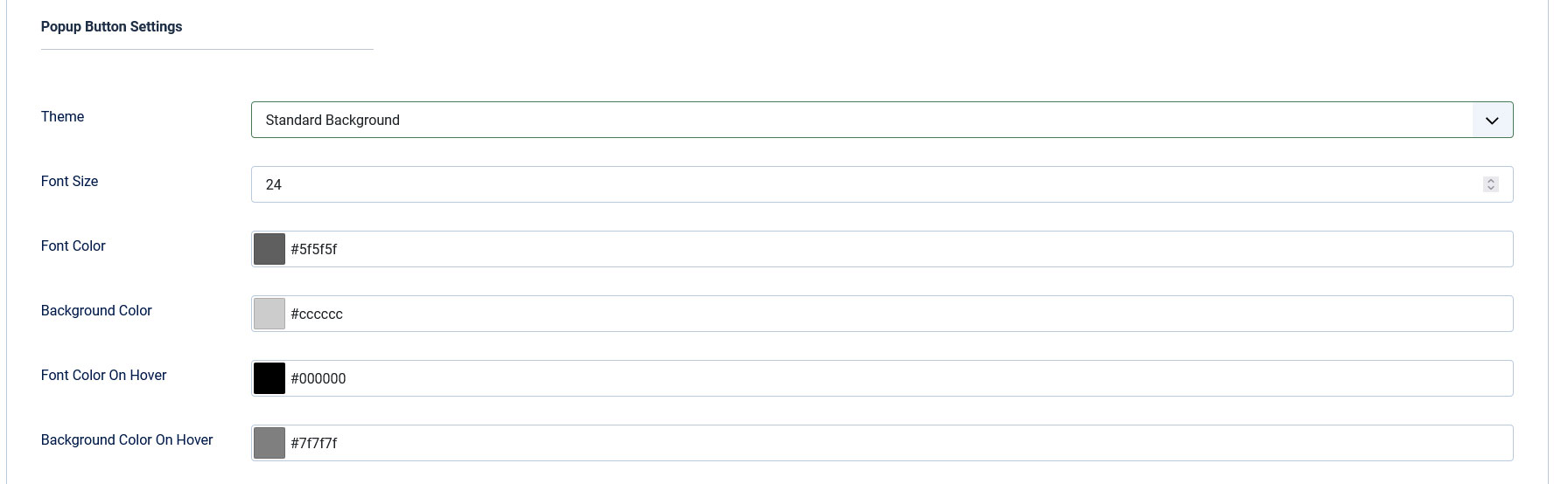
Popup Button Settings
- Theme: - choose the popup button's theme - either No Background / Standard Background / Rounded Background / Round Background;
- Border Radius: - type in the amount of radius, only available for the Rounded Background theme;
- Font Size: - select the font size;
- Font Color: - select the font color via an HTML color picker;
- Background Color: - select the background color via an HTML color picker;
- Font Color on Hover: - select the font color when the icon is hovered via an HTML color picker;
- Background Color on Hover: - select the background color when the icon is hoveredvia an HTML color picker.
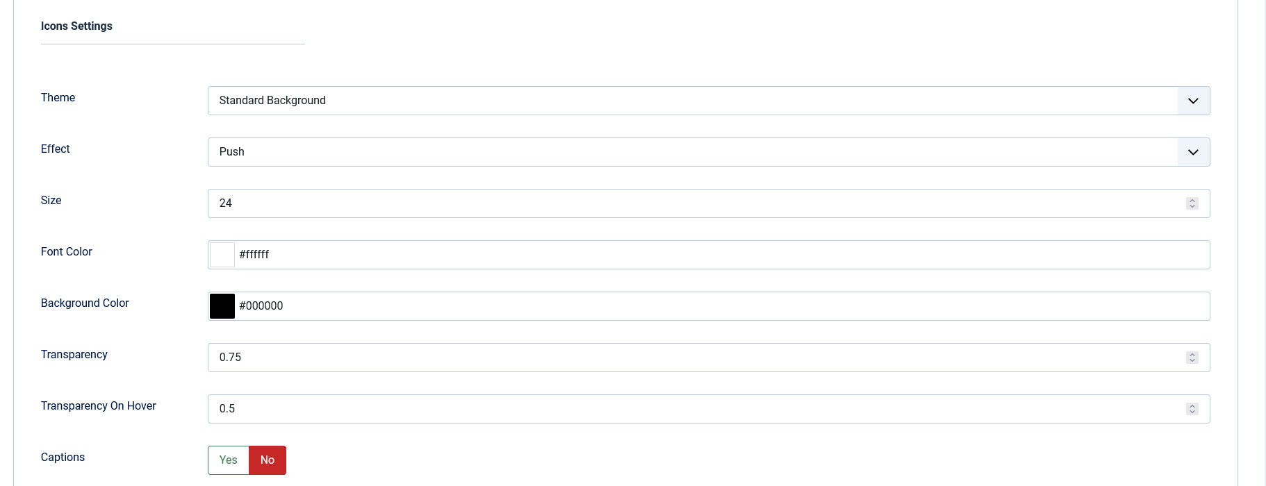
Icon settings
- Theme: Choose one of 4 options: No background / Standard background / Rounded background / Round background for the social links icons
- Effect: Choose one of 35 on-hover effects for the social icons
- Icon Size: Set the size for the social icons, in pixels
- Border Radius: - type in the amount of radius, only available for the Rounded Background theme;
- Icon Font Color: Choose a color for the social links icons' font via an HTML color picker
- Icon Background Color: Choose a color for the social links icons' background via an HTML color picker
- Icon Transparency: Set a transparency for the social icons in normal state. Make sure to use values between 0 (fully transparent) and 1 (opaque) (e.g. 0.25, 0.5, 0.75, etc. )
- Icon Transparency On Hover: Set a transparency for the social icons when hovered over. Make sure to use values between 0 (fully transparent) and 1 (opaque) (e.g. 0.25, 0.5, 0.75, etc. )
- Caption: Yes / No - Display a caption for each social network
Caption settings
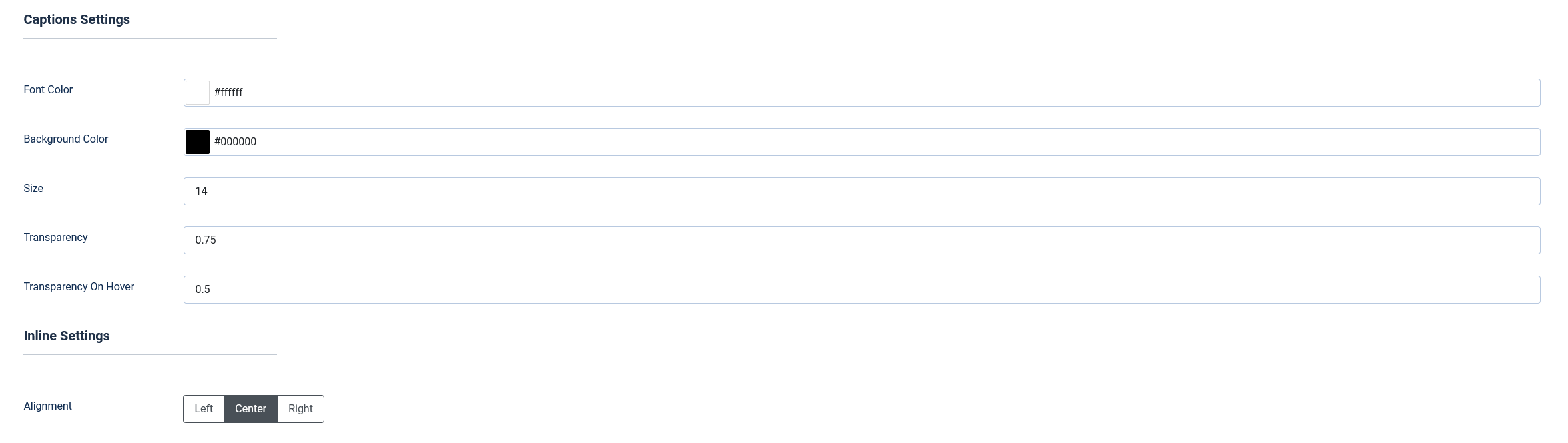
- Caption Font Color: Choose a color for the social links captions' font via an HTML color picker
- Caption Background Color: Choose a color for the social links captions' background via an HTML color picker
- Caption Size: Set the size for the social icons' captions, in pixels
- Caption Transparency: Set a transparency for the social icons's captions in normal state. Make sure to use values between 0 (fully transparent) and 1 (opaque) (e.g. 0.25, 0.5, 0.75, etc. )
- Caption Transparency On Hover: Set a transparency for the social icons' captions when hovered over. Make sure to use values between 0 (fully transparent) and 1 (opaque) (e.g. 0.25, 0.5, 0.75, etc. )
Inline settings
- Alignment: Left / Center / Right - set the social icon's alignment inside the container
Floating settings
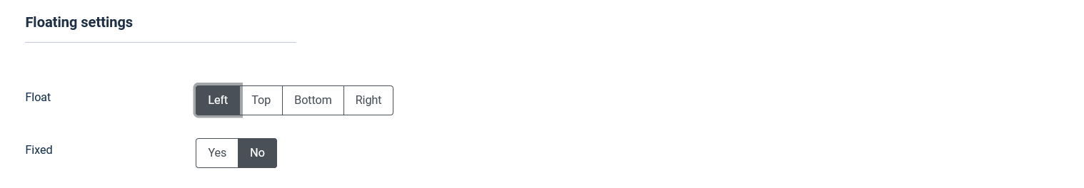
- Float: float the module to the Left / Top / Right or Bottom of the page - used in conjunction with the Positioning field explained above
- Fixed: Yes / No - make the social links sticky (will remain fixed when scrolling)
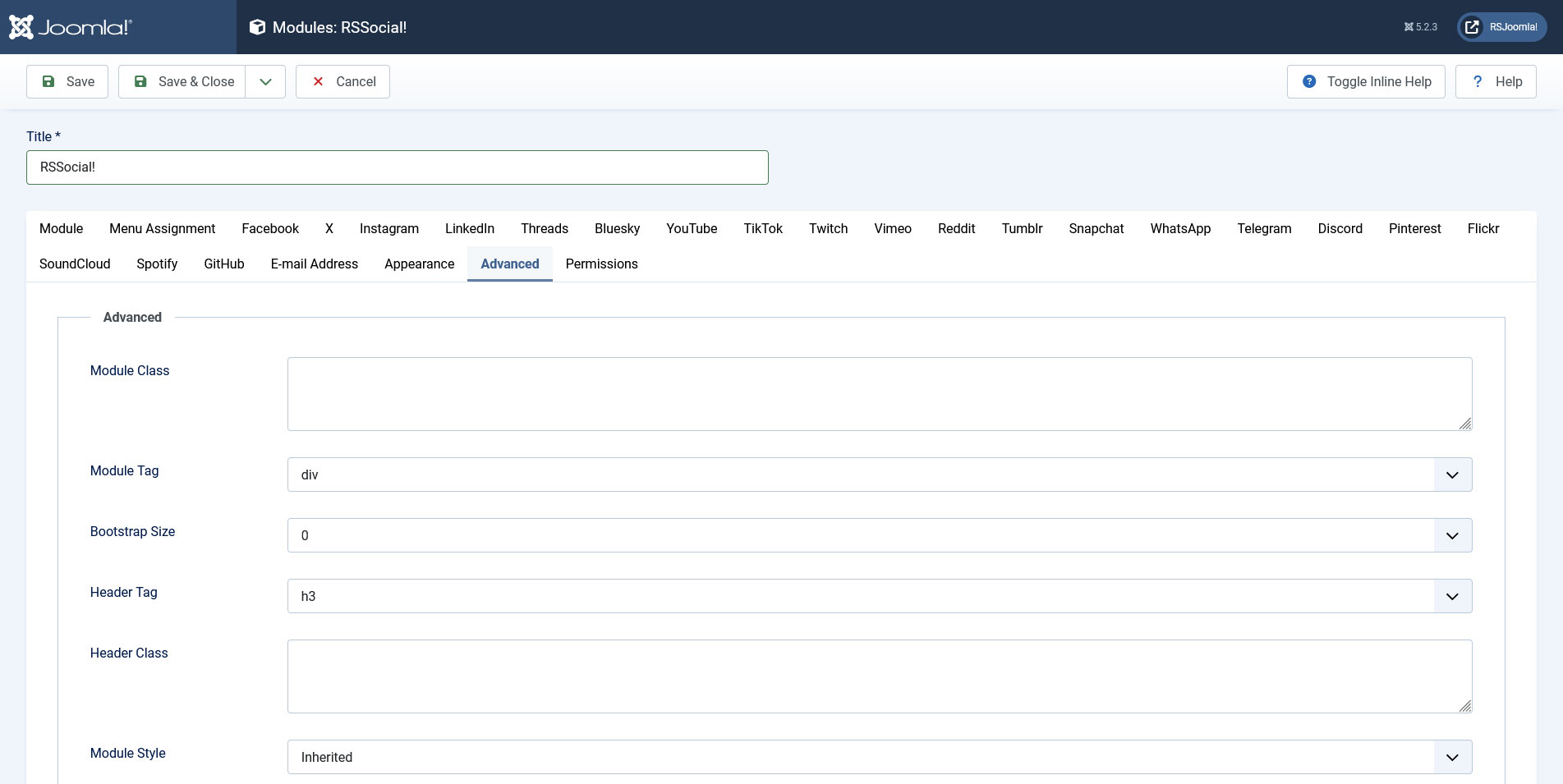
Advanced tab
- Module Class Suffix: Add a custom CSS class for the module's styling
- Module Tag: Select an HTML tag in which the module will be enclosed
- Bootstrap Size: Select how many columns the module will use (1-12)
- Header Tag: Select an HTML tag in which the module's title / header will be enclosed
- Header Class: Add a custom CSS class for the module's title / header
- Module Style: override the template's style for the module's selected position
13 persons found this article helpful.
You Should Also Read
Place the RSSocial! module inside a Joomla! article |
Using RSSocial! in module positions |
Change default ordering |
Recommend |