Using the template
After you have successfully installed the template as explained in the Installation Guide, we will start by setting RSMatias! as the default frontend template.
Head over to System >> Templates >> Site Template Styles >> Select RSMatias! from the template list and click on the "Make Default" button.
The template's configurable options can be found by going to System >> Templates >> Site Template Styles and selecting RSMatias! from the style column.
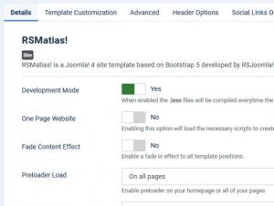
Details
- Development mode: When enabled the .less files will be compiled everytime the page is reloaded in front-end
- One Page Website: Enabling this option will load the necessary scripts to create a one page website, the navigation will be made using anchors(E.g.: Creating a menu item type System link >> External URL
- Fade Content Effect: Enable a fade in effect to all template positions.
- Preloader Load: Enable preloader on your homepage or all of your pages
- Preloader Effect: Choose a preloader effect.
- Scroll To Top Button: Add a fixed button which allows you to scroll to the top of the page with just one click.
- Use Gravatar: When set to Yes, this will show a Gravatar picture next to the author. Only works with content articles.
- Hide Homepage content: This option hides the home page and the modules within the column-left and colum-right positions.
Template Customization
Color Options
- Primary Color: Use this setting's color picker to set the primary color.
- Secondary Color: Use this setting's color picker to set the secondary color.
- Body Background Color: Use this setting's color picker to set the color of the body's background.
- Font Color: Use this setting's color picker to set the color of the website's content.
- Heading Color: Use this setting's color picker to set the color of the website's titles.
- Link Color: Use this setting's color picker to set the color of the links.
- Navbar Background: Use this setting's color picker to set the color of the navbar's background.
- Navbar font color: Use this setting's color picker to set the color of the navbar's content.
- Footer Background: Use this setting's color picker to set the color of the footer's background.
- Footer font color: Use this setting's color picker to set the color of the footer's content.
Visual Options
- Border Radius: The value of this parameter will affect the border radius.
- Button Radius: The value of this parameter will affect the button border radius.
Font Options
- Font size: The value of this parameter will affect the font-size of the whole content font size.
- Navbar font size: This option changes the font size of the navbar.
- H1, H2, H3, H4, H5, H6 font sizes: The default font-size value for Heading elements.
- Load Google Fonts: If enabled, Google fonts will be loaded to replace the current template fonts.
- Content Font: Changing this parameter will affect the content's font.
- Title Font: This parameter allows you to change the font family of the titles in your website.
- Navbar Font: You should use this option if you want to change the font family of the navbar.
- Google Font Subset: You can use this option to load a specific subset of the fonts choosed above.
- Extra CSS Selectors for titles using Google Font: Use this field to add css selectors that will inherit the title's font family.
- Extra CSS Selectors for content using Google Font: Use this field to add css selectors that will inherit the content's font family.
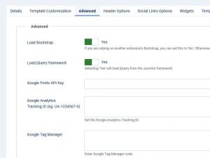
Advanced
- Load Bootstrap: If you are relying on another extension's Bootstrap, you can set this to No. Otherwise, Bootstrap should always be loaded with this template.
- Load jQuery framework: Selecting Yes will load jQuery from the Joomla! framework
- Google Fonts API Key: The google fonts are stored locally. Enter the Google Fonts API Key here to fetch them directly from the Google Servers
- Google Analytics 4: Enable to use Google Analytics 4.
- Google Analytics Tracking ID: In order to setup your Google Analytics property, all you have to do is paste here the Tracking Code.
- Google Tag Manager: In order to setup Google Tag Manager, all you have to do is paste here the code snippet that be placed immediately after the opening
<body>tag. - Custom
<head>tags: Add the custom tags you need to the head section of the site. Please note that the tags you add have to be proper markup validated, otherwise the site may not be displayed well! - Favicon: Select the image to be used as favicon
- Hide Copyright Link Setting this to Yes will remove the Joomla! Templates link from the frontend
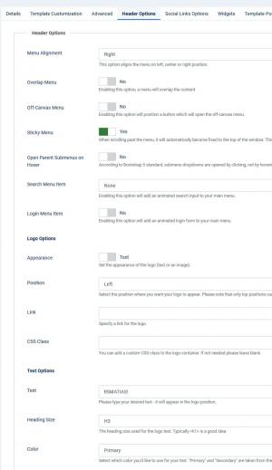
Header Options
- Menu Alignment: Select the position where you want your menu to appear. Please note that only top positions can be used (left, center, right).
- Overlap Menu: Enabling this option will position your menu absolute (it will overlap content), make sure you have some sort of header in order to be displayed properly (due to transparency).
- Off-Canvas Menu: Enabling this option will position a button which will open the off-canvas menu.
- Sticky Menu: If enabled, when scrolling past the menu, it will automatically become fixed to the top of the window. This will allow your users to quickly access the menu. This feature is only available on desktop version.
- Open Parent Submenus on Hover: According to Bootstrap 5 standard, submenu dropdowns are opened by clicking, not by hovering. If you wish to display the parent submenus by hovering set this option to 'No'.
- Search Menu Item: Enabling this option will add an animated search input to your main menu
- Login Menu Item: Enabling this option will add an animated login form to your main menu
Logo options
- Appearance: Set the appearance of the logo (text or image).
- Position: Select the position where you want your logo to appear. Please note that only top positions can be used (left, right).
- Link: Specify a link for the logo.
- CSS class: You can add a custom CSS class to the logo container. If not needed please leave blank.
Text options
- Text: Type your desired text - it will appear in the logo position.
- Heading Size: Select the heading size for your logo text.
- Color: Select which color you'd like to use for your text. Primary and Secondary are taken from the selected color scheme of the template.
Image options
- Image: Select the image to be used as logo.
- Image Alt Text: Insert alternate text for logo image.
Widgets
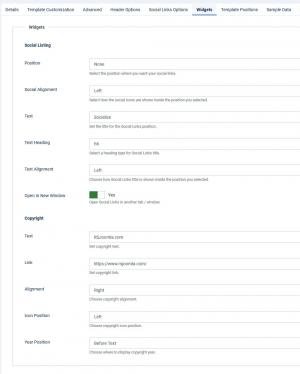
Social Listing
- Position: Select the position where you want your social links.
- Social alignment: Select how the social icons are shown inside the position you selected. Available alignments (left, center, right).
- Text: Set the title for the Social Links position.
- Text heading:
- Text Alignment: Select how Social Links title is shown inside the position you selected
- Open in new window: Open Social Links in another tab / window.
Copyright
- Text: Set copyright text.
- Link: Set the copyright link.
- Alignment: Choose copyright alignment.
- Icon position: Choose copyright icon position.
- Year position: Choose where to display copyright year.
Template Positions
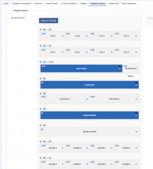
This feature allows you to customize and re-arrange the template positions.
Reorder positions: By clicking on Reset to default button, your changes will be reset to the default arrangement.
 This button allows you to reorder the position by dragging and dropping.
 Click on the Row settings button in order to customize the background color, margin top, margin bottom, padding top and padding bottom of the selected section.
 Column settings - customize the animation or add widgets to the selected position.
 Click in order to add a new module to the current section.
 Access the modules menu asociated with this position.
Sample Data
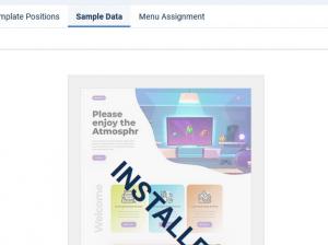
By selecting and clicking Install Sample Data you will install the exact sample data that we have included on the template's demo website. Note that this is optional, you do not necessarily need to install the sample data.
For the Sample Data to work properly, please make sure to first install the following:
- RSPageBuilder!.
- RSPageBuilder! Elements.
Note: The RSPageBuilder! Elements can be downloaded from the Modules section of the component.
- RSMediaGallery! Component.
- RSMediaGallery! Responsive Slider module.
- RSMediaGallery! Showcase module.
Note: The Showcase module can be downloaded from the Modules section of the component.
6 persons found this article helpful.


Social Links Options