Set up a search filter using the Filtering module
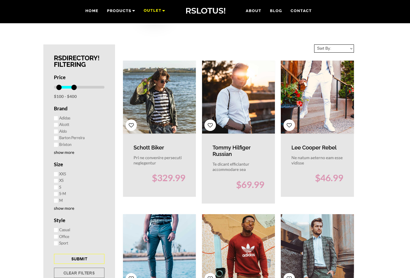
Any well-built directory needs to have strong filtering capabilities, especially the ones which contain large numbers of entries, in multiple categories. RSDirectory! includes a frontend module and advanced field configuration options to meet this need.
The Filtering module
This kind of functionality can be employed, in the frontend, using the Filtering module. However, since the module only includes a single option that refers to the actual search:
- Show Categories: Yes / No - Choose whether to allow frontend users to select one or more categories to filter by. The module will only search within the selected category / categories.
the largest part of the filtering functionality is actually being set up, in the backend, per field.
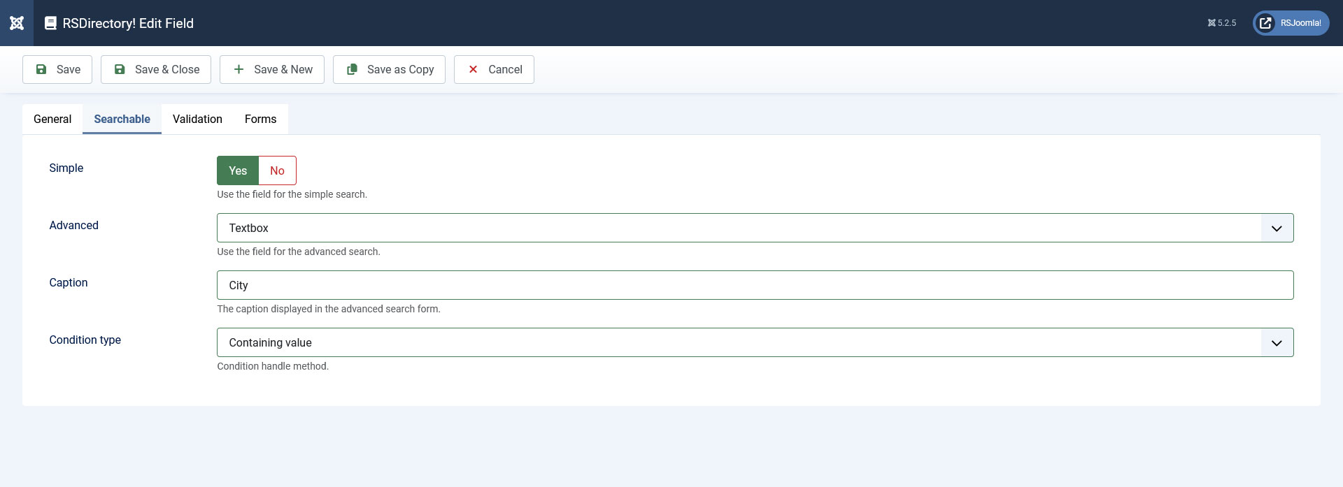
The Searchable tab
Each of RSDirectory!'s field types includes a variable number of parameters (depending on the field type) by which it can be searched for in the frontend, all grouped in the field's Searchable tab. We will provide an example for a textbox in this article.
Textbox search configuration example
Please access RSDirectory!'s dedicated demo website. Here, head to Components >> RSDirectory! >> Fields and select Textbox in the - Select Field Type - dropdown to the left. Next, scroll down to the city field, edit it and head to its Searchable tab. You will notice that the field's search parameters were configured as follows:
- The Advanced dropdown has the Textbox value selected. This means that a textbox will be displayed in the Filtering module, which will be associated with the current field (city). Users will need to manually type in the value they wish to search entries by in this field.
Note: If you wish to remove city from the search filters, simply set Advanced to None.
- The Caption field has the value City set. This means that, within the Filtering module in the frontend, City will be our field's caption. You can leave this blank, but this is not recommended, as frontend users will not know which field it is associated with.
- The Condition type dropdown is set to Containing value. This means that, when the user types in a value in the City textbox within Filtering module, the component will search for all values submitted in the city field that contain the submitted value. You can also set this to Strict (searches for the exact same submitted value), Starting with value (looks for submissions that begin with the provided value) or Ending with value (looks for submissions that end with the provided value).
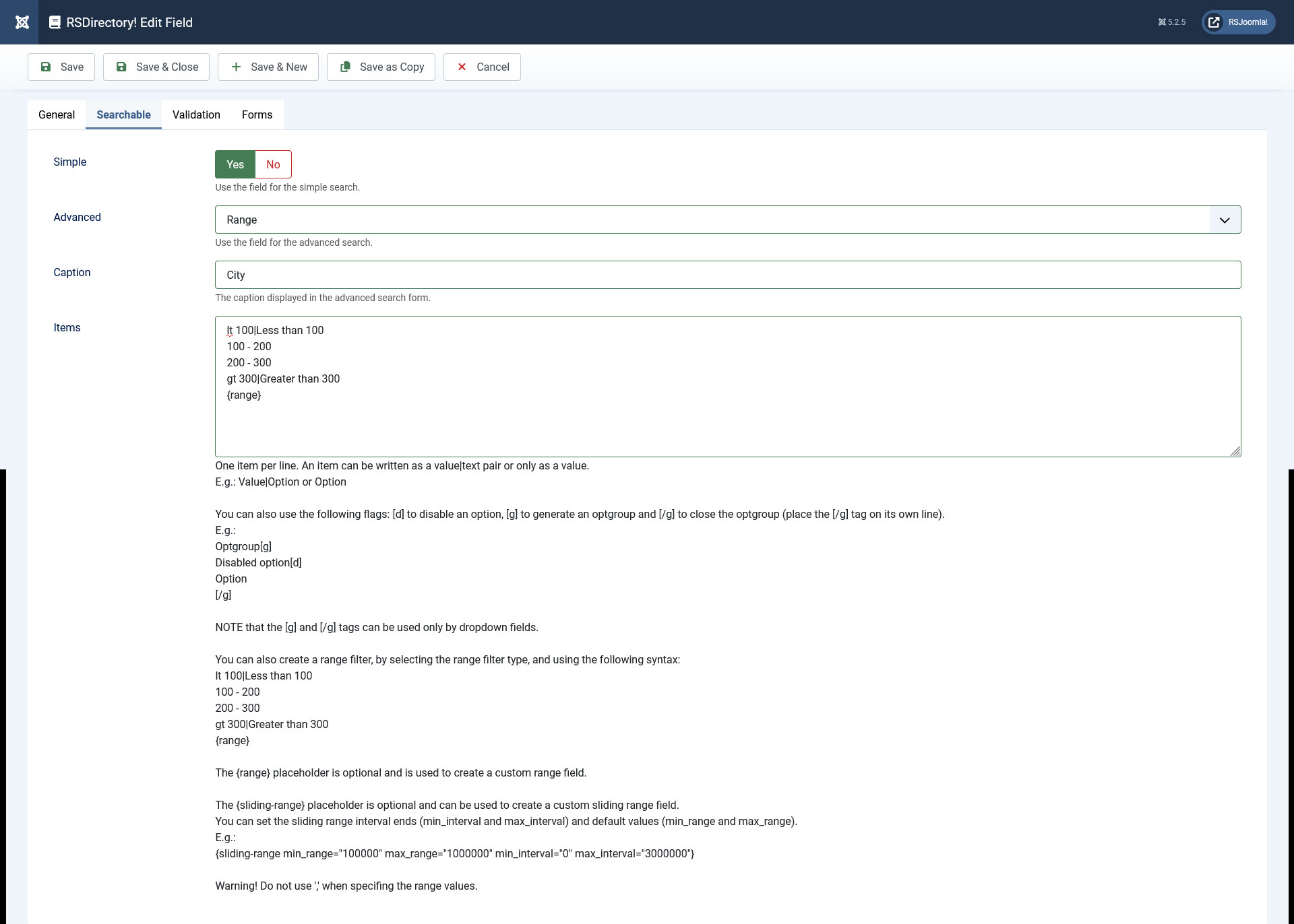
The Advanced dropdown
This field requires additional explanations, as it also offers some more complex search features:
-
Range: Using this option you can create a search filter that will look for submitted values found withtin one or more pre-defiend ranges that will be selectable in the Filtering module as checkboxes.
Each range item needs to be placed in the Items text area, on a separate line, in the following manner:
lt 100|Less than 100 - the component will interpret lt as less than and will look for values that are lower than, in our example, 100
100 - 200
200 - 300
gt 300|Greater than 300 - the component will interpret gt as greater than and will look for values that are higher than, in our example, 300
Using the {range} placeholder, you can add 2 textboxes to the Filtering module, also associated with the current search field, in which frontend users can define their own, custom range to search by.
-
Checkbox group: Using this option you can create a search filter that will look for submitted values equal to the value(s) selected in the Filtering module as a checkbox (or multiple checkboxes).
You will need to specify the selectable items in the Items field, in the select field traditional manner:
value|label or simply label (which will also be used as value).
-
Radio group: Using this option you can create a search filter that will look for submitted values equal to the value selected in the Filtering module as a radio group. Note that, since this is a radio group, a single value can be selected in the frontend.
You will need to specify the selectable items in the Items field, in the select field traditional manner:
value|label or simply label (which will also be used as value).
-
Dropdown: Using this option you can create a search filter that will look for submitted values equal to the value selected in the Filtering module as a radio group. Note that, since this is a radio group, a single value can be selected in the frontend.
You will need to specify the selectable items in the Items field, in the select field traditional manner:
value|label or simply label (which will also be used as value).
3 persons found this article helpful.
You Should Also Read
Filtering Module HOT |
Map Search module |
Simple Search Module |
The Search and Smart Search plugins |