Box
The System-RSTemplate! plugin brings in some pre-defined, fully customizable stylized containers. It gets installed along with the template, and should be published automatically. If you are to experience any issues with this feature, first make sure to check that the plugin didn't get unpublished for whatever reason.
To access the Shortcodes feature, click on the  button found at the bottom side of the text editor that you are using (available for Joomla! Content articles, Custom HMTL modules, etc. ). This functionality is employed through the Button - RSTemplate! Shortcodes plugin which also gets installed along with the template and is published automatically. If the button does not show up in your editor, make sure that the plugin didn't get unpublished.
There are 3 types of boxes available for use, each having multiple styles to choose from: Icons, Images and Specials. In this article we will provide explanations for each of the styles, including information such as: the elements each style includes (titles, images, buttons, etc.), screenshots with their default appearance, shortcodes examples and how to edit each element.
Article Contents(click to jump to section)
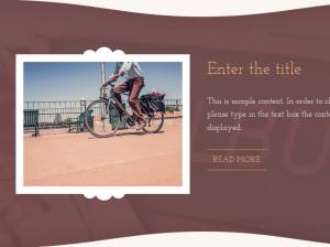
Full width dark horizontal image - Images
- Title: The box's title
- Text: A description for the presented item
- Image: An image of the presented item
- Button: A linkable button. You can customize its caption and the page it links to
In the text area below you can find a code example for the box presented in this section. The image in the gallery to the right illustrates a preview of the result.
Shortcode:
Back to contents
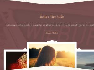
Full width dark vertical image - Images
- Title: The box's title
- Text: A description for the presented item
- Image: An image of the presented item
- Button: A linkable button. You can customize its caption and the page it links to
In the text area below you can find a code example for the box presented in this section. The image in the gallery to the right illustrates a preview of the result.
Shortcode:
Back to contents
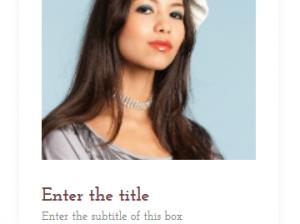
Simple vertical image - Images
- Title: The box's title
- Text: A description for the presented item
- Image: An image of the presented item
- Button: A linkable button. You can customize its caption and the page it links to
In the text area below you can find a code example for the box presented in this section. The image in the gallery to the right illustrates a preview of the result.
Shortcode:
Back to contents
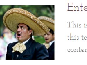
Simple horizontal image - Images
- Title: The box's title
- Text: A description for the presented item
- Image: An image of the presented item
In the text area below you can find a code example for the box presented in this section. The image in the gallery to the right illustrates a preview of the result.
Shortcode:
Back to contents
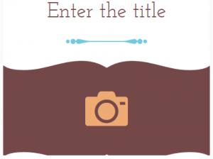
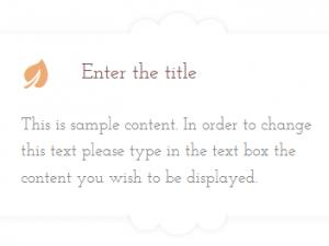
Simple vertical icon - Icons
- Title: The box's title
- Text: A description for the presented item
- Icon: An icon that will be displayed inside the container
- Button: A linkable button. You can customize its caption and the page it links to
In the text area below you can find a code example for the box presented in this section. The image in the gallery to the right illustrates a preview of the result.
Shortcode:
Back to contents
Simple horizontal icon - Icons
- Title: The box's title
- Text: A description for the presented item
- Icon: An icon that will be displayed inside the container
In the text area below you can find a code example for the box presented in this section. The image in the gallery to the right illustrates a preview of the result.
Shortcode:
Back to contents
Personal - Specials
- Image / Button: An image + button combination. Set and image and a link that the user will be redirected to when clicking on the image
- Title: The box's title
- Text: A description for the presented item
- 4 x Social buttons: By default, 4 social links buttons are included: Facebook, Twitter, LinkedIn and Google Plus.
- Plus (+) button: Linkable button
In the text area below you can find a code example for the box presented in this section. The image in the gallery to the right illustrates a preview of the result.
Shortcode:
Back to contents
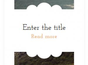
Featured - Specials
- Box Background: This is an image displayed as the box's background
- Title: The box's title
- Button: A linkable button. Its caption is defaulted to READ MORE
In the text area below you can find a code example for the box presented in this section. The image in the gallery to the right illustrates a preview of the result.
Shortcode:
Back to contents
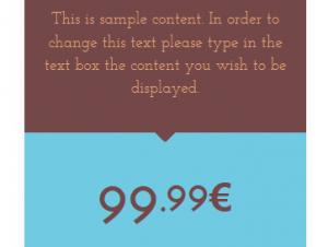
Price - Specials
- Title: The box's title
- Text: A description for the presented item
- Price: The presented item's price
- Features 1-5: 5 fields in which you can specify some of the presented product's features
- Button: A linkable button. Its caption is defaulted to BUY NOW
In the text area below you can find a code example for the box presented in this section. The image in the gallery to the right illustrates a preview of the result.
Shortcode:
Back to contents
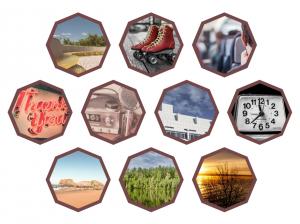
Honeycomb images - Specials
- 10 x Image / Link: 10 linkable images shaped as honeycombs
In the text area below you can find a code example for the box presented in this section. The image in the gallery to the right illustrates a preview of the result.
Shortcode:
Back to contents
How to edit the items
Each item can be edited by right-clicking on it and choosing Edit. The possibility to delete them is also available, by clicking on Remove.
Editing a Title:
Editing a Box Text:
Editing an Image / Background:
Editing a Button:
| Back To Top |
Note: Although we've only illustrated how editing the items is done for the Full width dark horizontal image container, the very same process is applicable for the rest of the box types as well.
One person found this article helpful.
You Should Also Read
Accordion |
Carousel |
Tabs |
Adding Shortcodes within Bootstrap Grid System |

