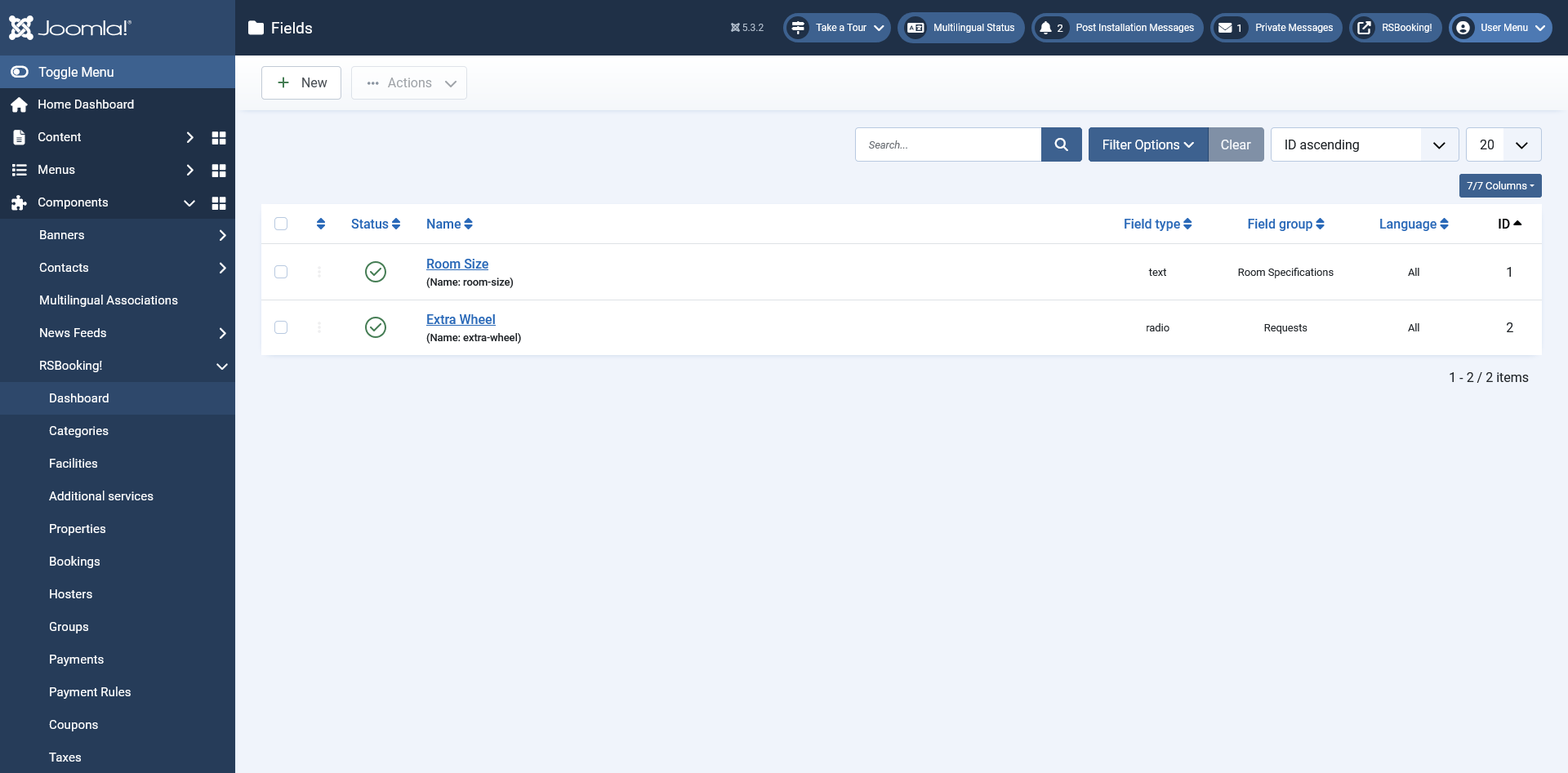
Fields
List of available Fields
- Status: Indicates whether the field is published (active) or unpublished (inactive).
- Name: The name of the field.
- Field type: The type of the field (e.g., text box, dropdown, checkbox).
- Field group: The group to which this field belongs
- ID: The unique identifier assigned to the field. This is used internally and cannot be changed.
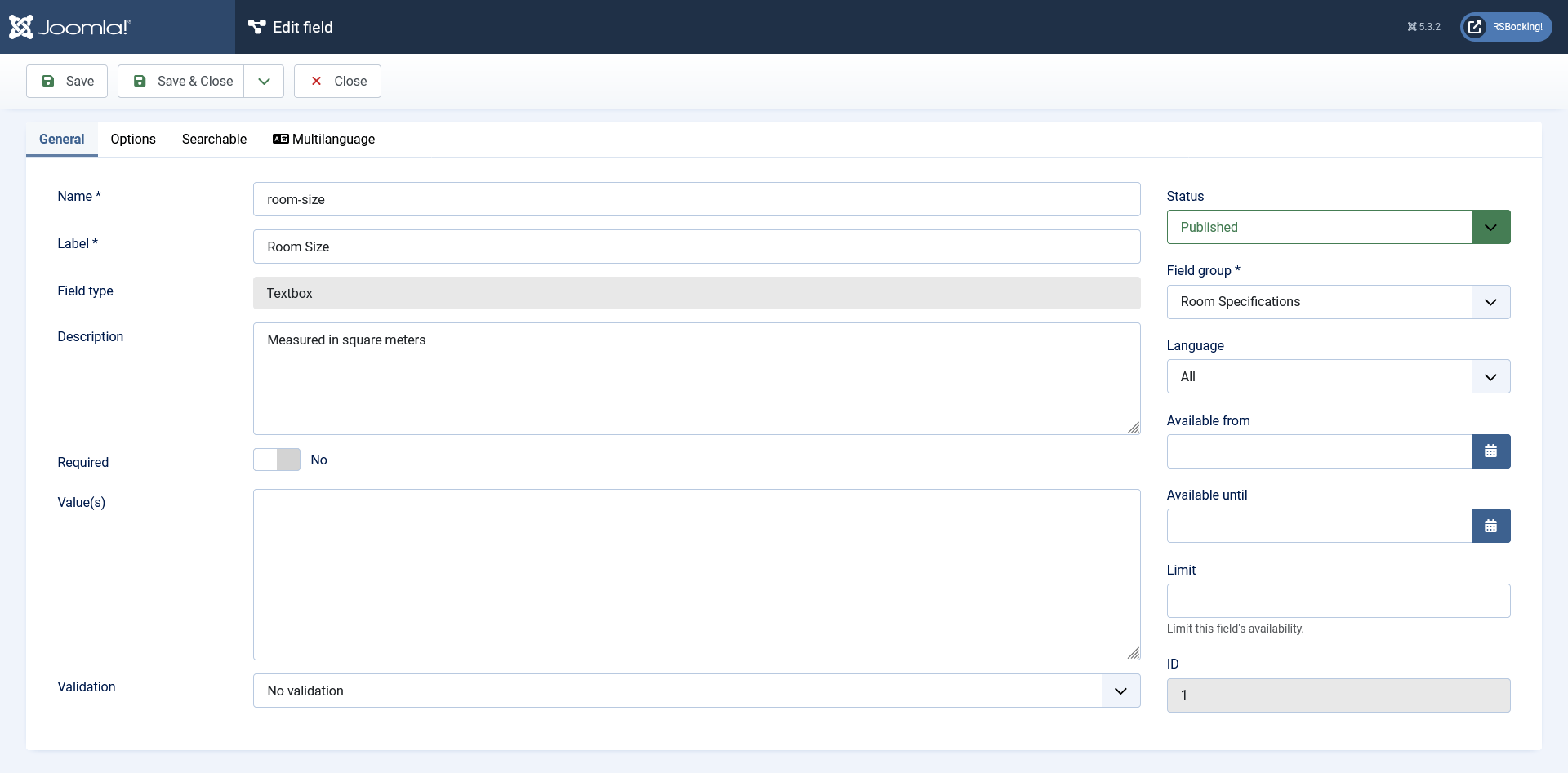
General Tab
- Name: The internal name of the field (not visible to users).
- Label: The field label displayed to users during the booking process.
- Field Type: Specifies the type of input element:
- Textbox: A single-line text input.
- Textarea: A multi-line text input.
- Dropdown: A list of selectable options.
- Radio: A group of radio buttons for single selection.
- Checkbox: A checkbox (can allow multiple selections).
- Free Text: Static text displayed without input capability.
- File Upload: Allows users to upload a file.
- Calendar: A date picker with optional time selection.
- Description: A brief explanation displayed beneath the field (not available for Free Text).
- Required: Specifies whether the field must be filled in (Yes/No).
- Multiple: Allows multiple selections (available only for Dropdown fields).
- Max File Size (KB): Sets the maximum allowed file size in kilobytes (available only for File Upload).
- Allowed Extensions: Defines the file types that can be uploaded, separated by commas (available only for File Upload).
- Show Time: Enables time selection (available only for Calendar fields).
- Output Format: Defines the output format for the calendar field (available only for Calendar).
- Value(s): Sets the default value(s) of the field.
- Validation: Validation rules for the field input (available only for Textbox and Textarea):
- No validation
- Letters
- Numbers
- Letters and numbers
- Letters (+ accented characters)
- Letters (+ accented characters) and numbers
- Email Address
- Email Address with DNS check
- USA ZIP Code
- Phone Number (123-456-7890)
- Credit Card (AMEX, Diners, Discover, MasterCard, Visa)
- IP Address
- Valid URL (http/https only)
- Regex: Custom regular expression validation
- Status: Indicates whether the field is published (active) or unpublished (inactive).
- Field Group: The group or section to which this field belongs.
- Language: The frontend language in which the field is available.
- Available From: The start date when the field becomes visible.
- Available Until: The end date after which the field is no longer visible.
- Limit: Sets a time-based restriction for the field’s availability (in days).
- ID: A unique identifier assigned to the field. This is used internally and cannot be changed.
You can also use custom PHP code in the Radio / Checkbox / Dropdown Value(s) area, similar to:
//<code>
_your_PHP_code_here
//</code>
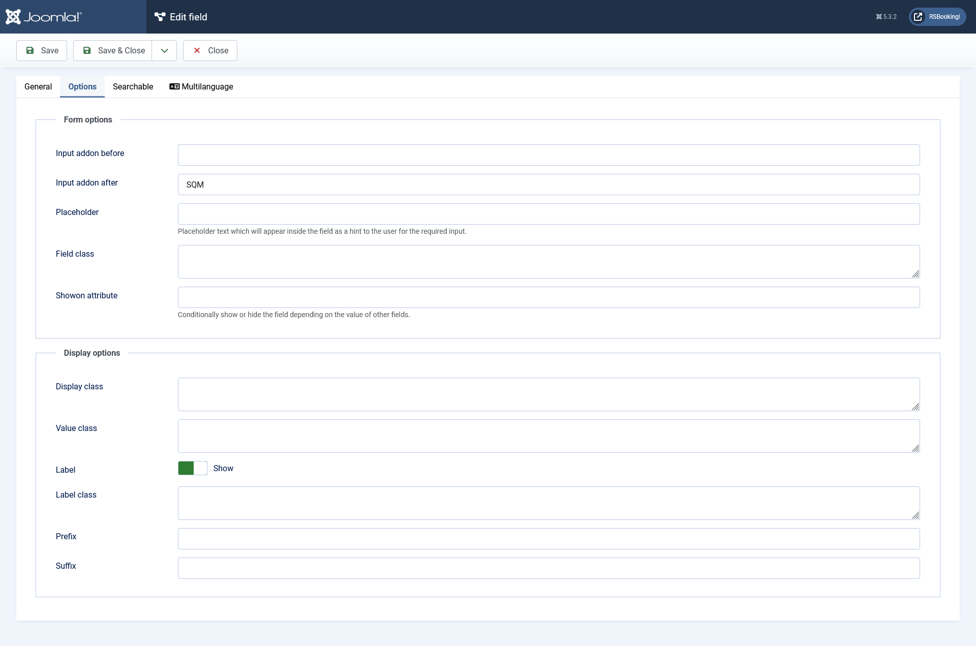
Options Tab
- Form Options:
- Input addon before: displays this text before the field.
- Input addon after: displays this text after the field.
- Placeholder: displays this text inside the field, which will disappear when the field is focused.
- Field Class: Adds a custom CSS class to the field element for styling purposes.
- Showon Attribute: Enables conditional display of the field based on the value of other fields.
- Display Options:
- Display Class: Adds a CSS class to the field container for advanced layout or style customization.
- Value Class: Adds a CSS class specifically to the field value (e.g., input or selection element).
- Label: Choose whether the field label should be shown or hidden.
- Label Class: Adds a CSS class to the label element (available only if the label is set to 'Show').
- Prefix: Text displayed before the field value (e.g., currency symbols).
- Suffix: Text displayed after the field value (e.g., units of measurement).
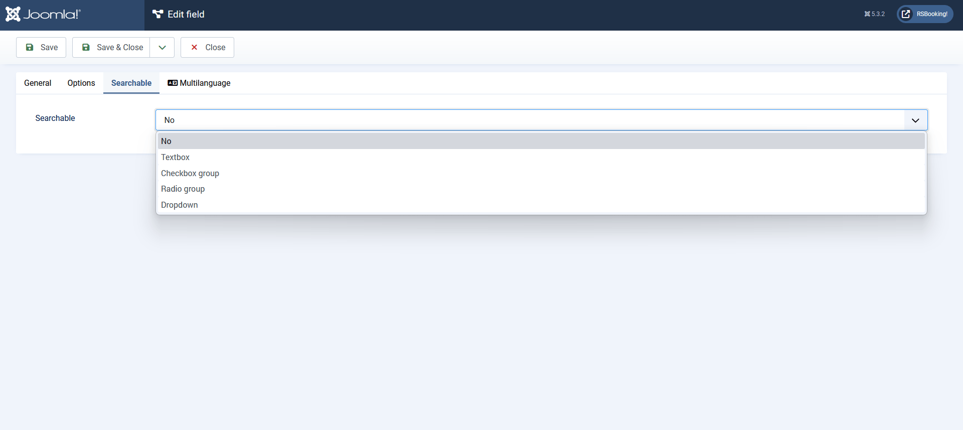
Searchable Tab
- Searchable: Determines if and how the field can be used as a search filter.
- No: The field is not searchable and will not appear in the search form.
- Textbox: Enables text input filtering.
- Caption: The label shown above the search field.
- Condition Type: Defines how the entered value should be matched:
- Strict
- Starting with value
- Ending with value
- Containing value
- Greater than the value
- Greater or equal to the value
- Less than the value
- Less or equal to the value
- Checkbox Group: Allows multiple value selection using checkboxes.
- Caption: The label displayed for the group of checkboxes.
- Use Range: Enables filtering between a range of selected values (Yes/No).
- Use Field Items: Use the predefined items from the field (Yes/No).
- Items: Custom values shown as selectable options.
- Condition Type: Defines the matching rule:
- Strict
- Starting with value
- Ending with value
- Containing value
- Greater than the value
- Greater or equal to the value
- Less than the value
- Less or equal to the value
- Radio Group: Enables single selection from predefined values.
- Caption: The label for the radio button group.
- Use Field Items: Use the items defined in the field (Yes/No).
- Items: Custom values to be displayed.
- Condition Type:
- Strict
- Starting with value
- Ending with value
- Containing value
- Greater than the value
- Greater or equal to the value
- Less than the value
- Less or equal to the value
- Dropdown: Allows single or multiple selection from a list.
- Caption: The label shown above the dropdown.
- Use Field Items: Pulls options from the field's predefined list (Yes/No).
- Items: Custom list of selectable values.
- Condition Type:
- Strict
- Starting with value
- Ending with value
- Containing value
- Greater than the value
- Greater or equal to the value
- Less than the value
- Less or equal to the value
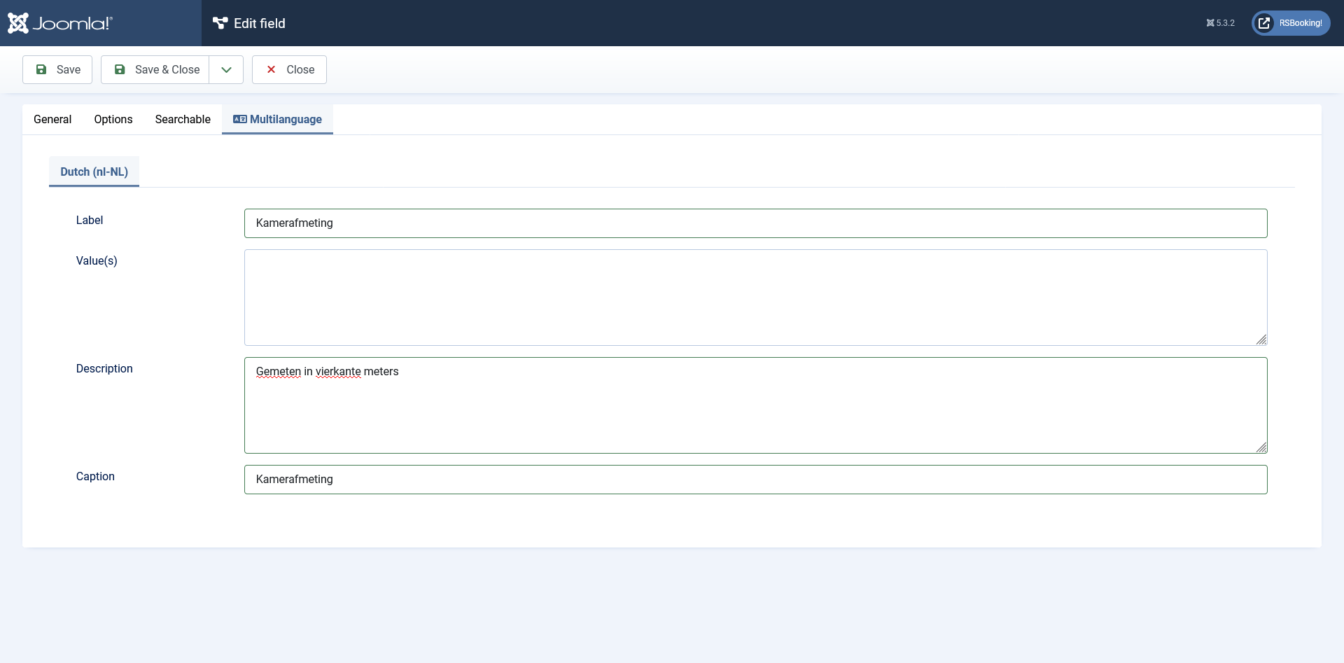
Multilanguage tab
For this tab to be available, navigate to: Components > RSBooking! > Configuration > General tab and set the 'Enable multilanguage' option to Yes. This will activate multilanguage fields throughout the component.
Here, based on the languages you've installed, you can provide translations for the followings:
- Label
- Value(s)
- Description
- Caption
Conditional fields
Conditional fields let you dynamically show or hide specific fields based on a user's selections. To begin, filter the fields by Field Groups — once you do, a new 'Conditionals' button will appear at the top.
Click the 'Conditionals' button to open a modal window, which includes the following options:
- New Conditional: Create a new condition to control when fields are shown or hidden.
- Delete Conditionals: Remove one or more existing conditions.
- Name: View a list of all configured conditional fields.
When you click 'New Conditional,' you can set rules to either hide or show one or more fields when any or all selected conditions are met.
