Tabs
The System-RSTemplate! plugin brings in some pre-defined, fully customizable stylized containers. It gets installed along with the template, and should be published automatically. If you are to experience any issues with this feature, first make sure to check that the plugin didn't get unpublished for whatever reason.
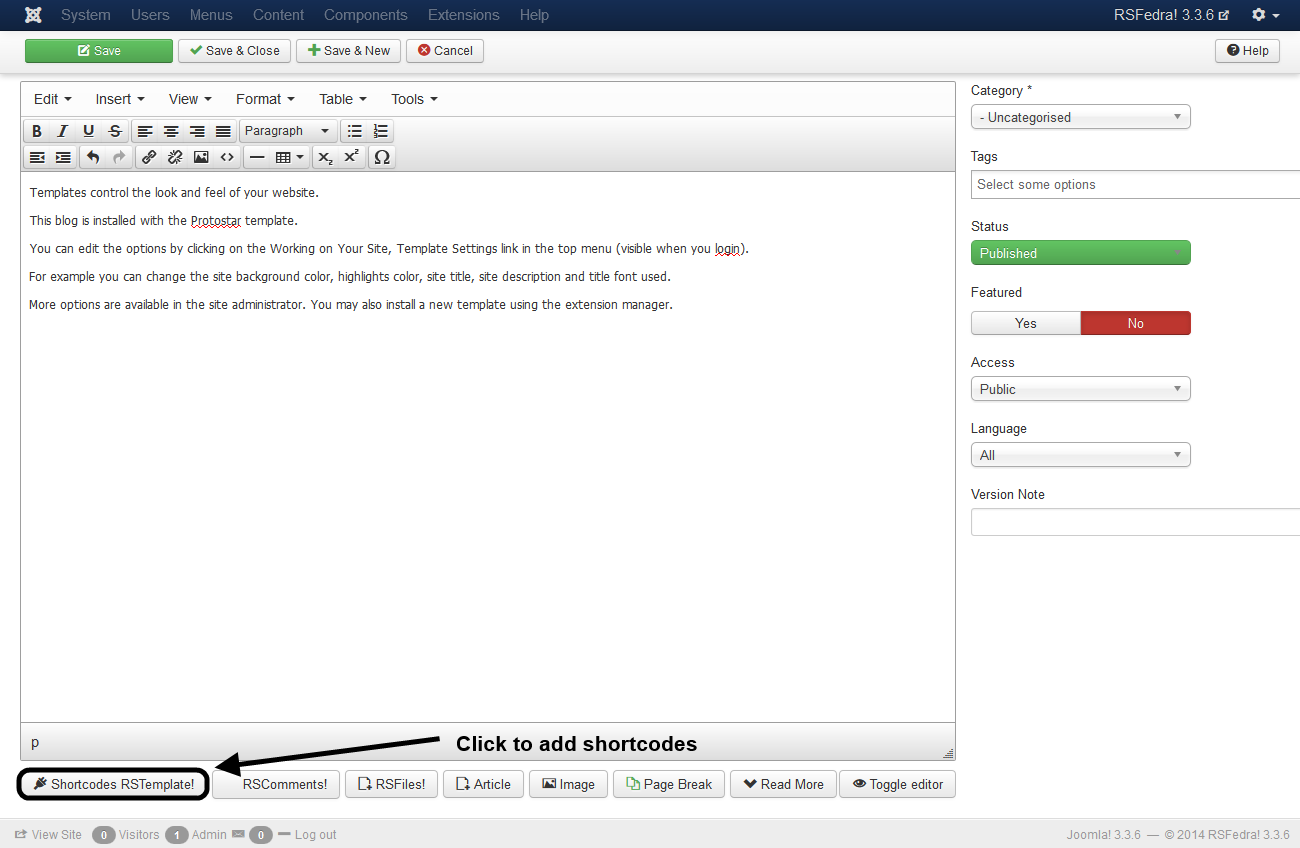
To access the Shortcodes feature, click on the 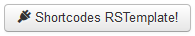 button found at the bottom side of the text editor that you are using (available for Joomla! Content articles, Custom HMTL modules, etc. ). This functionality is employed through the Button - RSTemplate! Shortcodes plugin which also gets installed along with the template and is published automatically. If the button does not show up in your editor, make sure that the plugin didn't get unpublished.
Simple Tabs
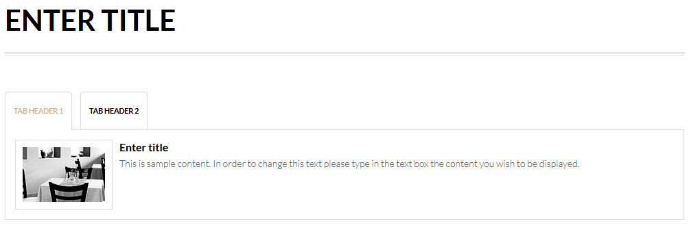
The Tab container can include an unlimited number of customizable tabs. Only a single tab's contents can be displayed at a given time.
- Title: The tab container's title
- Tab Header: The tab's header
- Tab Text: Specify the text description that will be displayed inside the tab
- Tab Image: Remove or change the image
HTML Code:
<div id="lorem_tab1571" class="rstpl-tabs">
  <div class="rstpl-box-title-left rstpl-m-bot">
    <h2>Tabs</h2>
  </div>
  <div class="rstpl-box-tabs">
    <ul class="nav nav-tabs visible-desktop" id="lorem_tab2140">
      <li class="active"><a class="rstpl-box-header" data-toggle="tab" href="#lorem_first_header4115">Lorem First Header</a>
      </li>
      <li class=""><a class="rstpl-box-header" data-toggle="tab" href="#lorem_second_header6654">Lorem second header</a>
      </li>
    </ul><div class="accordion hidden-desktop" id="lorem_tab2140-accordion"></div>
    <div class="tab-content rstpl-padding rstpl-border visible-desktop" id="tabsContent7591">
      <div id="lorem_first_header4115" class="tab-pane active">
        <div class="rstpl-box-image">
          <img alt="" src="/rspenta/templates/rspenta/images/sampledata/images/120x80-1.jpg">
        </div>
        <div class="rstpl-box-title">Lorem Tab</div>
        <div class="rstpl-box-content">Lorem ipsum dolor sit amet, consectetur adipiscing elit. Mauris semper arcu quam, ut mollis turpis interdum ac. Ut a semper tortor, faucibus consectetur neque. Nulla non augue tempor, placerat nisi tincidunt, sodales eros. Praesent at mollis massa.
          <br>
          <br> Lorem ipsum dolor sit amet, consectetur adipiscing elit. Mauris semper arcu quam, ut mollis turpis interdum ac. Ut a semper tortor, faucibus consectetur neque. Nulla non augue tempor, placerat nisi tincidunt, sodales eros. Praesent at mollis
        </div>
      </div>
      <div id="lorem_second_header6654" class="tab-pane">
        <div class="rstpl-box-title">Lorem Second Tab</div>
        <div class="rstpl-box-content">Lorem ipsum dolor sit amet, consectetur adipiscing elit. Mauris semper arcu quam, ut mollis turpis interdum ac. Ut a semper tortor, faucibus consectetur neque. Nulla non augue tempor, placerat nisi tincidunt, sodales eros. Praesent at mollis massa.
        </div>
      </div>
    </div>
  </div>
</div>
One person found this article helpful.
You Should Also Read
Accordion |
Carousel |
Box |
Adding Shortcodes within Bootstrap Grid System |