Plugin - Advanced Form Fields

The RSForm!Pro Advanced Form Fields plugin expands the already robust set of form components. Read on to find out the new fields you can use to give your forms a more unique look & functionality.
Downloading and Installing the plugin
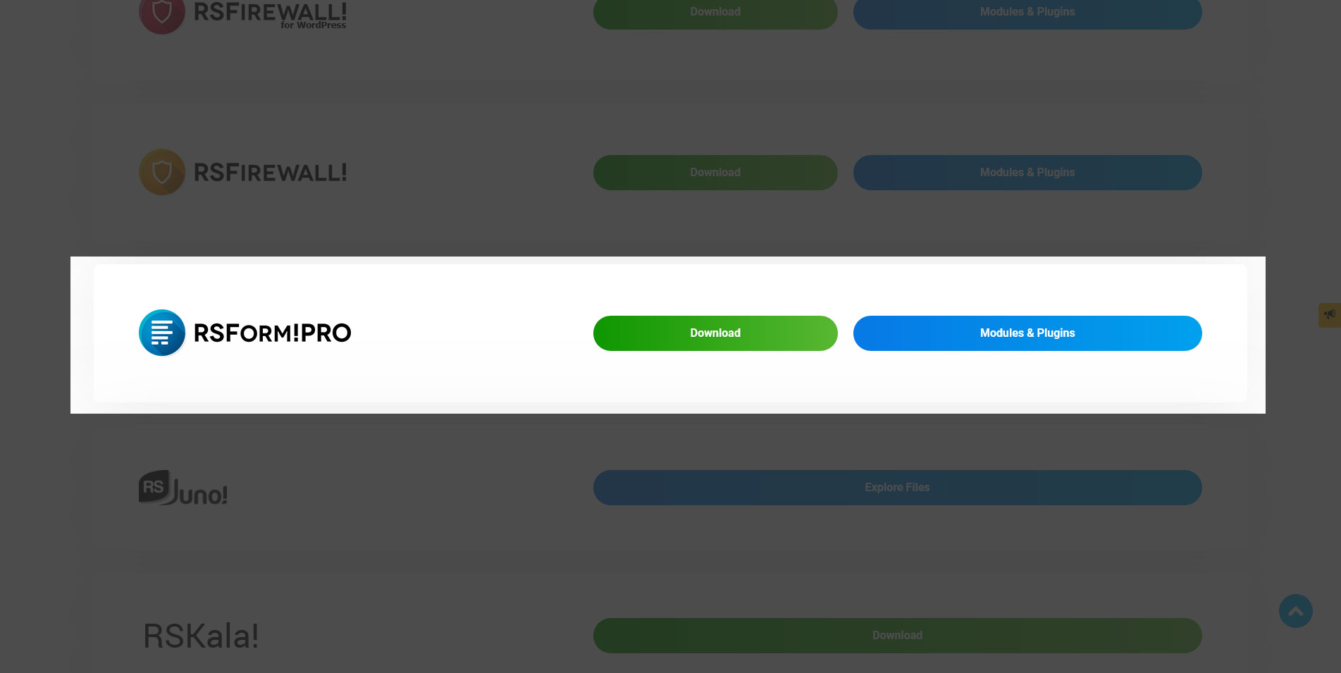
Download
You can download the plugin by logging with your purchase user, then head to Downloads > Paid Downloads > RSForm!Pro > Modules & Plugins > "Advanced Form Fields".
Install
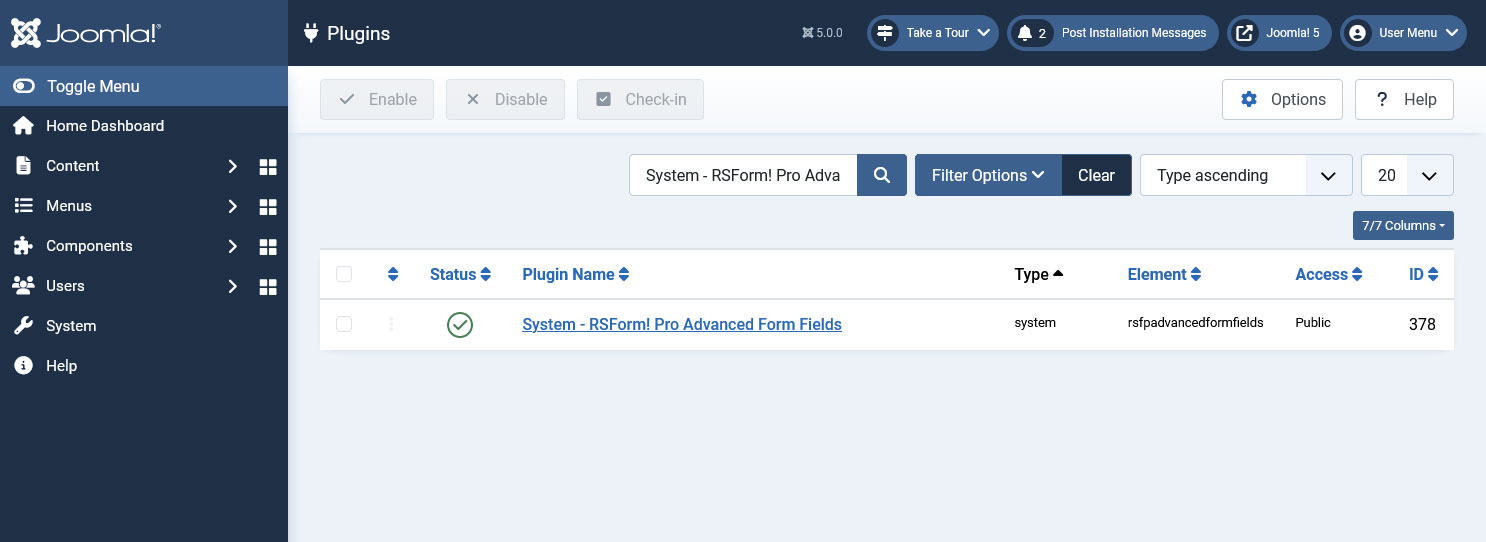
In the backend of your Joomla! installation go to Extensions > Manage > Install, and upload and install the plugin. Next thing would be to check if the plugin is published, and to do so, navigate to Extensions > Plugins, search for the "System - RSForm! Pro Advanced Form Fields" plugin and ensure it is published.
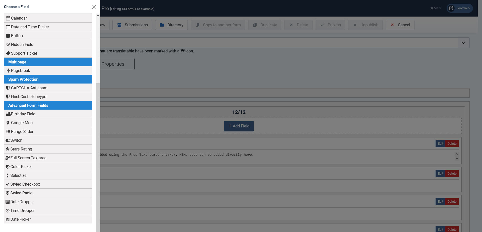
Introducing extra form fields
1. Switch - with this field you can add a switch-like button in your form.
2. Rating Field - visual stars rating element.
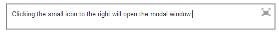
3. Full Screen Textarea - textarea field that allows you to display its contents in a modal window.
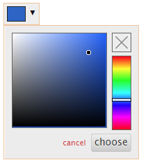
4. Color picker - color picker field that allows choosing a color.
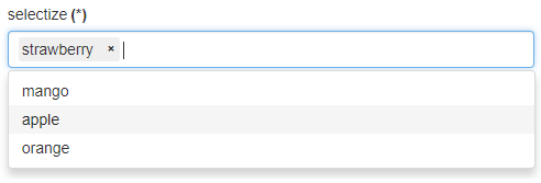
5. Selectize field - an advanced dropdown-like field that allows users to both search for a particular value from the items list and also select multiple values in a tag like display.
6. Styled Checkbox - a checkbox with a more stylish display for the items input field.
7. Styled Radio - radio group with a more stylish display for the items input field.
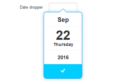
8. Date Dropper - date selection calendar with a unique look.
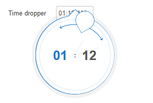
9. Time Dropper - time selection field with a visual clock display.
10. Date Picker - Date picker field with a visual calendar to choose a date.
Explore the functionality of this plugin by seeing it in action on our demo server.
Field Options
Switch Field
- Name: the name of the field.
- Caption: the caption that will be displayed in the front-end for this field.
- Description: the description of the field.
- Required: control if the field is required for the submission to be made.
- Validation message: the message displayed when the field input is not correct.
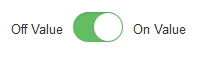
- Initial State: the initial state of the switch. You can choose between an "Off" and "On" state.
- Off Value: default 0; the value that will be captured on your submission when the switcher is off.
- On Value: default 1; the value that will be captured on your submission when the switcher is on.
- Toggled On Price: this is the value that will be used in the calculations when the user toggles the Switch On.
- Additional attributes: here you can add extra attributes to the field.
Stars Rating

- Name: the name of the field.
- Caption: the caption that will be displayed in the front-end for this field.
- Description: the description of the field.
- Required: control if the field is required for the submission to be made.
- Validation message: the message displayed when the field input is not correct.
- Number of stars: the number of stars that will be used for the rating input.
- Rating type: Choose between a single color or gradient type fill of the rating stars.
- Base Color: the base color used for the rating stars (hexadecimal).
- Fill Color: the fill color used when the user sets a rating (hexadecimal).
- Start Color (only shown when the rating type is set to gradient): the initial gradient color (hexadecimal).
- End Color (also shown only when the gradient rating type is used): the end gradient color (hexadecimal).
- Allow Half Stars: enable this option to allow users to select in half star increments.
- Additional attributes: here you can add extra attributes to the field.
Full Screen Textarea
- Name: the name of the field.
- Caption: the caption that will be displayed in the front-end for this field.
- Default value: the default value that will be displayed in the front-end.
- Description: the description of the field.
- Required: control if the field is required for the submission to be made.
- Validation rule: the conditions required for the field to pass the validation.
- Validation message: the message displayed when the field input is not correct.
- Cols: the number of columns the field will take up.
- Rows: the number of rows the field will take up.
- Max Width: the maximum fullscreen modal width.
- Max Height: the maximum fullscreen modal height.
- Max Size: This is the maximum number of characters that can be typed in this field eg. 255
- Show Character Count: Yes / No. If enabled, it will display a paragraph showing the character count.
- Placeholder: the helpful text value that will be shown in the front-end using the placeholder HTML attribute.
- Additional attributes: here you can add extra attributes to the field.
Color Picker
- Name: the name of the field.
- Caption: the caption that will be displayed in the front-end for this field.
- Default value: the default value that will be displayed in the front-end.
- Description: the description of the field.
- Required: control if the field is required for the submission to be made.
- Validation message: the message displayed when the field input is not correct.
- Additional attributes: here you can add extra attributes to the field.
Selectize
- Name: the name of the field.
- Caption: the caption that will be displayed in the front-end for this field.
- Items: here you can set the values that will be displayed in the field (each value on a new line).
- Description: the description of the field.
- Required: control if the field is required for the submission to be made.
- Validation message: the message displayed when the field input is not correct.
- Field Theme: this field allows you to choose a specific theme so that the field can better match your template. Options available: Legacy, Standard, Bootstrap2, Bootstrap3, Bootstrap4 and Bootstrap5.
- Multiple: allow users to select multiple values in the field.
- Number of items (this option is shown only when the multiple selection option is enabled): the number of items the user can select.
- Additional attributes: here you can add extra attributes to the field.
Styled Checkbox

- Name: the name of the field.
- Caption: the caption that will be displayed in the front-end for this field.
- Items: here you can set the values that will be displayed in the field.
- Description: the description of the field.
- Required: control if the field is required for the submission to be made.
- Flow: here you can choose how the field will be displayed. Available options: Horizontal / Vertical ( 2, 3, 4 or 6 columns)
- Max Selections: limit the number of selections (0 implies unlimited).
- Min Selections: add a minimum amount of selections for this field to be submitted.
- Additional attributes: here you can add extra attributes to the field.
Styled Radio

- Name: the name of the field.
- Caption: the caption that will be displayed in the front-end for this field.
- Items: here you can set the values that will be displayed in the field.
- Description: the description of the field.
- Required: control if the field is required for the submission to be made.
- Flow: here you can choose how the field will be displayed. Available options: Horizontal / Vertical ( 2, 3, 4 or 6 columns)
- Additional attributes: here you can add extra attributes to the field.
Date Dropper
- Name: the name of the field.
- Caption: the caption that will be displayed in the front-end for this field.
- Default value: the default value that will be displayed in the front-end.
- Description: the description of the field.
- Required: control if the field is required for the submission to be made.
- Validation message: the message displayed when the field input is not correct.
- Initial Animation: choose the animation type.
- Date Format: the date format used to display the selected date (you can use between: d, m, Y, D, l, F, M, n, j).
- Force Date: force the date selection value to either be from today onwards or until today.
- Min Year: the minimum year the user is allowed to select a date from.
- Max Year: the maximum year the user is allowed to select a date from (if you set a value lower than the current year, the current year will be taken into consideration instead).
- Years Range: this option will split the available years in the specified chunk value.
- Primary Color: the primary color used in the calendar field (hexadecimal).
- Text Color: the text color (hexadecimal).
- Background Color: the color of the calendar background (hexadecimal).
- Border Size: the size of the calendar border (default: 1px solid #08C).
- Border Radius Value: you can set a rounded border for the calendar using this option (integer values; default: 8).
- Drop Shadow: add a drop shadow effect to your calendar; by default set to: 0 0 10px 0 rgba(0, 136, 204, 0.45
- Drop Width: the width of the drop down (integer value; default: 124).
- Additional attributes: here you can add extra attributes to the field.
Time Dropper
- Name: the name of the field.
- Caption: the caption that will be displayed in the front-end for this field.
- Default value: the default value that will be displayed in the front-end.
- Description: the description of the field.
- Required: control if the field is required for the submission to be made.
- Validation message: the message displayed when the field input is not correct.
- 12 Hours Format: choose between a 12H and 24H format for the time selection field.
- Time Format: the time format used to display the selected time (you can use between: H, h, m, HH, hh, mm, a, A).
- Initial Animation: the initial animation used to display the time selection clock.
- Set Current Time: automatically set the value of the field to the current time (user time).
- Primary Color: the primary color used in the clock field (hexadecimal).
- Text Color: the text color (hexadecimal).
- Background Color: the color of the clock background (hexadecimal).
- Border Color: the color of the clock background (hexadecimal).
- Additional attributes: here you can add extra attributes to the field.
Date Picker
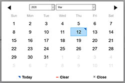
- Name: the name of the field.
- Caption: the caption that will be displayed in the front-end for this field.
- Default value: the default value that will be displayed in the front-end.
- Description: the description of the field.
- Required: control if the field is required for the submission to be made.
- Date Modifier: Choose to link this calendar to another calendar on your form.
- Date Validation: Set this to Yes if you'd like to validate the date upon submission based on the current date format.
- Validation message: The message displayed when the field input is not correct.
- Date Format: the date format used to display the selected date (you can use between: d, m, Y, D, l, F, M, n, j).
- For example, for a Day - Month - Year type of display, you can use d-m-Y.
- Min Date (m/d/Y): The submitter will not be able to select a date below the one specified here. Custom PHP codes can be used in between the //<code> and //</code> tags.
- Max Date (m/d/Y): The submitter will not be able to select a date past the one specified in this field. Custom PHP codes can be used in between the //<code> and //</code> tags
- Select Years: Choose if the visitor can select or not the years.
- Select Months: Choose if the visitor can select or not the months.
- First Day of Week: Choose with what day should the week start.
- Week Day Format: Display format of the weekday names - values are 'short' (first two/three letters) or 'full' (all letters).
- Months Format: Display format of the months names - values are 'short' (first three letters) or 'full' (all letters).
- Readonly: Make the input field read-only (cannot be typed in).
- Disable All: enable this to disable all dates of the calendar. Use this in combination with Disable Exceptions option.
- Disable Week Days: Select which days of the week should be disabled. Eg: 1,2,3... Keep in mind that if the weekdays starts with Monday then 1 is Monday, otherwise 1 is Sunday.
- Disable Exceptions: Only the weekdays/dates/intervals specified here will be allowed. Use only m/d/Y format. Custom PHP code can be used in between the //<code> and //</code> tags.
- Eg. weekdays: 1,2,3, etc. This will allow to be selected all the corresponding days in the calendar.
- Eg. dates: 05/23/2020, 05/23/2020. These dates will be available for selection.
- Eg. intervals: 05/23/2020 - 05/29/2020, 06/15/2020 - 06/22/2020. All the dates from these intervals will be available. - Additional attributes: here you can add extra attributes to the field.
Developer guider for the Date Picker can be found here: https://amsul.ca/pickadate.js/date/
Version 3.2.0
- Updated - Pico CSS layout support.
Version 3.1.9
- Fixed - 'Date Picker' label was pointing to an incorrect ID.
Version 3.1.8
- Added - 'Max Size' and 'Show Character Count' options for the 'Full Screen Textarea' field
Version 3.1.7
- Updated - Support for 'Preview Field' functionality.
Version 3.1.6
- Added - Joomla! 5 native compatibility - no longer needs the 'Behaviour - Backward Compatibility' plugin.
Version 3.1.5
- Fixed - 'Selectize' was showing an incorrect value when being hidden by Conditional Fields.
- Fixed - 'Switch' field was not being initialized properly.
Version 3.1.4
- Updated - Date Picker, Date Dropper and Time Dropper textboxes did not have the correct classes on Bootstrap 3/4/5 and Uikit 3
- Updated - Date fields can be sorted in the Directory area as a 'Date'
- Updated - Bumped minimum requirements to use Joomla! 3.10.0 and RSForm! Pro 3.1.10
Version 3.1.3
- Updated - 'Min Selections' can be set for 'Styled Checkbox' fields.
Version 3.1.2
- Fixed - In some cases the 'Selectize' items were showing up in a different order than the one specified.
Version 3.1.1
- Added - Field Themes for the 'Selectize' field: Bootstrap 4 and Bootstrap 5
Version 3.1.0
- Updated - Fields will now be placed in the 'Advanced Form Fields' group.
Version 3.0.1
- Updated - Accessibility improvements: Styled Radio and Checkboxes generate an 'id' attribute for the label in the form of 'fieldname0-lbl'.
- Updated - Accessibility improvements: Styled Radio and Checkboxes generate an 'id' attribute in the form of 'fieldname-grouplbl' for the 'Caption', which is referenced by each item with an 'aria-labelledby' attribute.
- Updated - Accessibility improvements: Styled Radio and Checkboxes are now contained inside a '<div role="group"></div>' container.
- Fixed - 'Styled Checkbox' and 'Styled Radio' were not showing the correct number of columns when using the Foundation layout.
Version 3.0.0
- Updated - Joomla! 4.0 and RSForm! Pro 3.0 compatibility.
Version 1.1.3
- Fixed - 'Switch' field was incorrectly selected when form failed validation.
Version 1.1.2
- Updated - 'Stars Rating' can be used in 'Conditional Fields'.
Version 1.1.1
- Updated - 'Advanced Radio Group' and 'Advanced Checkbox Group' fields now show up as radio and checkbox groups instead of dropdowns when editing a submission using the Directory.
Version 1.1.0
- Added - 'Date Picker' field for accessible calendar fields.
- Updated - Calculations now work for 'Date Dropper' and 'Time Dropper' fields.
- Updated - Bumped minimum requirements to use RSForm! Pro 2.3.10
Version 1.0.12
- Added - 'Placeholder' option to the 'Selectize' field.
- Fixed - 'Color Picker' is now validated correctly if set as 'Required'.
Version 1.0.11
- Added - 'Show Input' option to the 'Color Picker' field.
Version 1.0.10
- Added - 'Switch' fields can now be used in calculations by supplying a 'Toggled On Price'.
Version 1.0.9
- Added - Bulgarian translation to 'Date Dropper' field.
- Fixed - 'Date Dropper' field would allow disabled dates in versions of Internet Explorer.
- Fixed - If no 'Max Year' is defined in a 'Date Dropper' field, default to current year.
Version 1.0.8
- Fixed - The 'Display Textarea New Lines As br' option was not working for the 'Full Screen Textarea' field.
Version 1.0.7
- Fixed - Wrong forced width and height for 'Date Dropper' and 'Time Dropper' fields.
Version 1.0.6
- Added - Multiple columns display for the 'Styled Radio' and 'Styled Checkbox' fields.
Version 1.0.5
- Fixed - When editing a 'Styled Radio' field in a submission, if no value was available the first value was incorrectly selected.
Version 1.0.4
- Fixed - The 'Full Screen Textarea' field was not working correctly if present multiple times on the page.
- Fixed - 'Selectize' fields had a wrong forced min-width.
Version 1.0.3
- Fixed - 'Styled Radio' and 'Styled Checkbox' fields were not working correctly on mobile.
- Fixed - Conditional Fields now reset correctly with the 'Styled Radio', 'Styled Checkbox' and 'Switch' fields.
Version 1.0.2
- Fixed - 'Switch' field was incorrectly popping up the keyboard on mobile devices.
Version 1.0.1
- Fixed - 'Full Screen Textarea' was not passing the correct value when submitting the form.
Initial Release
111 persons found this article helpful.