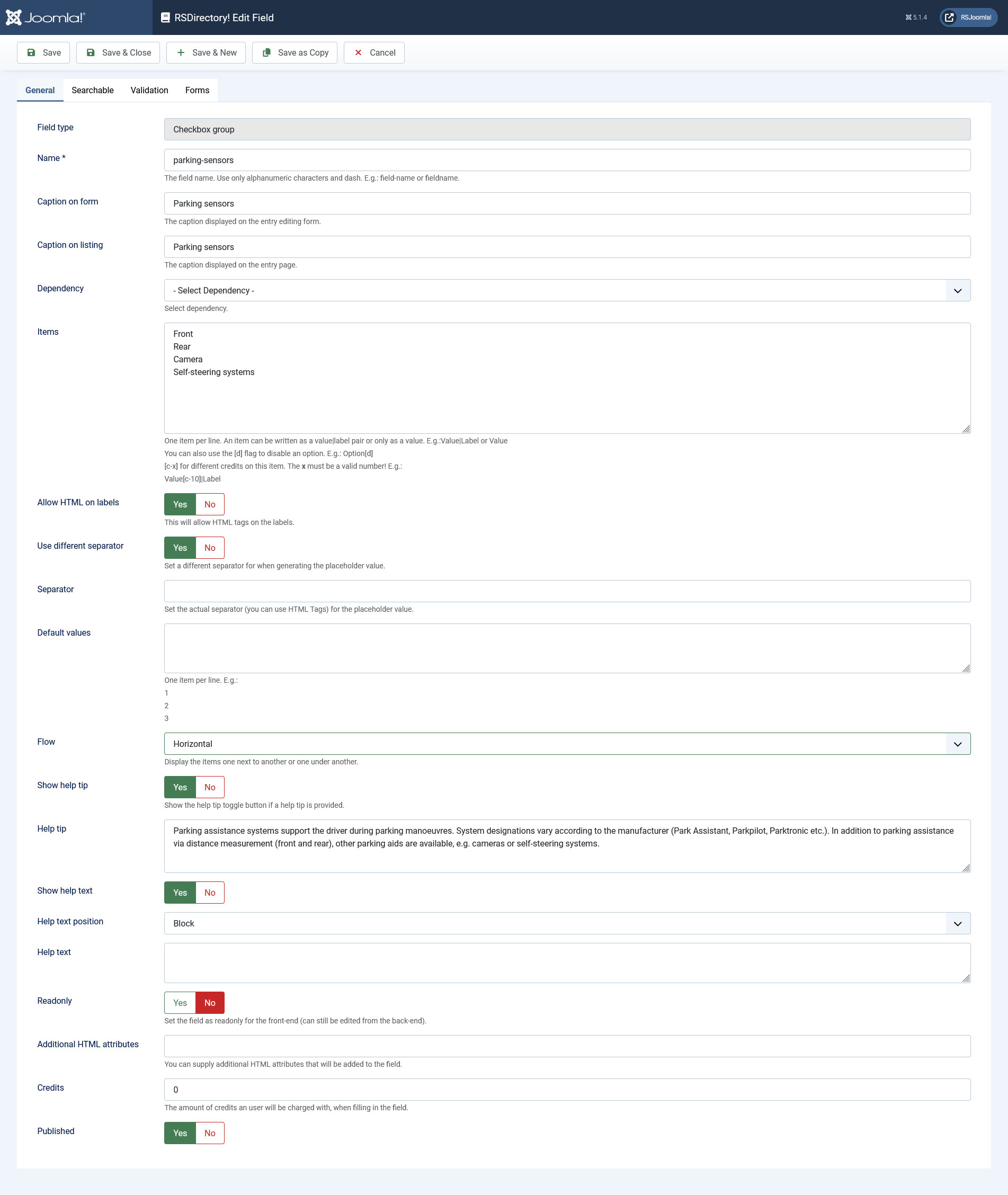
Checkbox group
General
In this tab you can set up an internal name, frontend caption, default value and other frontend displaying options for your field.
- Field type: Specifies the field's type
- Name: The field's internal name (not visible in the frontend)
- Caption on form: The field name that will be displayed in the entry submission form
- Caption on listing: The field name that will be displayed in the listing
- Dependency: Choose from one of the available select fields. You will then need to specify separate item sets for each of the selected field's items. When selecting a dependency item, the corresponding item set will be displayed for the current field. Checkboxes cannot be selected as dependency parents for other fields, they can only be children in this manner.
- Items: Specify the selectable items, one on each line
- Allow HTML on labels: Yes / No - This will allow HTML tags on the labels.
- Use different separator: Yes / No - Set a different separator for when generating the placeholder value.
- Separator: Set the actual separator (you can use HTML Tags) for the placeholder value.
- Default values: You can set a default value for each of the field's items (which can be modified in the frontend and backend)
- Flow: Choose between: Horizontal - display the items next to eachother / Vertical - display the items one on top of the other
- Show help tip: Choose whether to display a help tip associated with the field or not. The help tip will be displayed as a clickable questionmark button to the right side of the field.
- Help tip: The text to be displayed in the help tip
- Show help text: Choose whether to display a help tip associated with the field or not
- Help text position: The help text's positioning: Inline / Block
- Help text: The text to be displayed
- Additional HTML attributes: You can specify additional HTML attributes for the field, for example readonly="readonly"
- Credits: Specify the credit cost
- Published: Render the field as published or unpublished
The checkbox field Default value area allows you to add custom PHP scripts.
Important!
Credits can now be added independently for every item, for example:
- Item 1[c-10]|10 credits - if user choose 'Item 1' value, then 10 credits will be charged
- Item 2[c-20]|20 credits - if user choose 'Item 2' value, then 20 credits will be charged
- Item 3 - if user choose 'Item 3' value, then the default credits set within the 'Credits' area will be charged
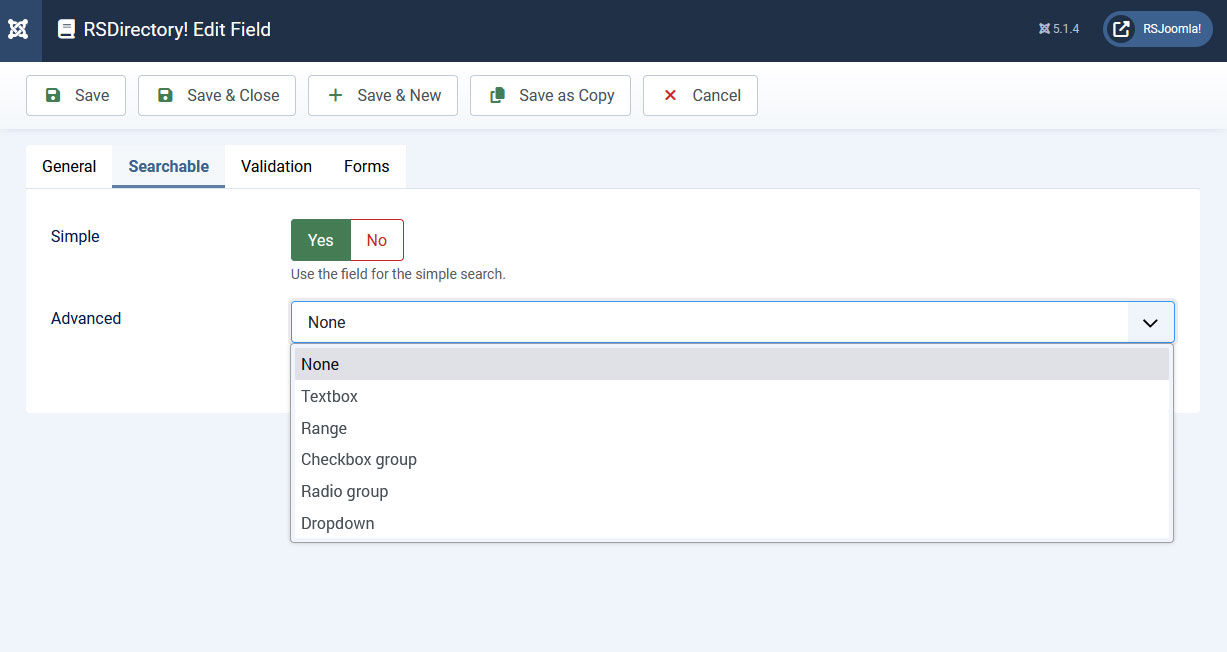
Searchable
In this tab you can set up in which types of searches the field will be included.
Simple
Set whether the field can be searched for using the Simple Search module or not: Yes / No
Advanced:
Set whether the field can be searched for using the Filtering module. You can choose from one of the following types of fields that will be displayed within the module:
-
Textbox: Displays a textbox within the module, in which the user can type a keyword or a value to filter entries by. The following fields will be added in the field's backend configuration area:
- Caption: The caption that will be displayed in both the Search and Filtering modules
- Condition type: Choose a search condition: Strict (limits the search to the typed in value or keyword), Starting with value (looks for submissions that contain the provided value at the beginning), Ending with value (looks for submissions that contain the provided value at the end) or Containing value (looks for submissions that contain the provided value in between).
-
Range: Displays a vertical checkbox group containing value intervals that the module will filter entries by
- Caption: The caption that will be displayed in both the Search and Filtering modules
- Use field items: Set to Yes if you wish to use the same items specified in the field's configuration. Setting the option to No will enable the following field:
- Items: Please consult the Select field items configuration section below.
-
Checkbox group:
- Caption: The caption that will be displayed in both the Search and Filtering modules
- Use field items: Set to Yes if you wish to use the same items specified in the field's configuration, set to No if you wish to specify your own in the following field:
- Items: Please consult the Select field items configuration section below.
- Condition type: Will be available when Use field items: is set to Yes. You will need to choose a search condition: Strict (limits the search to the typed in value or keyword), Starting with value (looks for submissions that contain the provided value at the beginning), Ending with value (looks for submissions that contain the provided value at the end) or Containing value (looks for submissions that contain the provided value in between).
-
Radio group:
- Caption: The caption that will be displayed in both the Search and Filtering modules
- Use field items: Set to Yes if you wish to use the same items specified in the field's configuration, set to No if you wish to specify your own in the field below:
- Items: Please consult the Select field items configuration section below.
- Condition type: Will be available when Use field items: is set to Yes. You will need to choose a search condition: Strict (limits the search to the typed in value or keyword), Starting with value (looks for submissions that contain the provided value at the beginning), Ending with value (looks for submissions that contain the provided value at the end) or Containing value (looks for submissions that contain the provided value in between).
-
Dropdown:
- Caption: The caption that will be displayed in both the Search and Filtering modules
- Use field items: Set to Yes if you wish to use the same items specified in the field's configuration. Otherwise, specify the items to be displayed in the following field:
- Items: Please consult the Select field items configuration section below.
- Condition type: Available regardless of the situations presented above. You will need to choose a search condition: Strict (limits the search to the typed in value or keyword), Starting with value (looks for submissions that contain the provided value at the beginning), Ending with value (looks for submissions that contain the provided value at the end) or Containing value (looks for submissions that contain the provided value in between).
Searchable tab select field items configuration
Dropdowns, radio and checkbox groups items
You need to specify one item per line. An item can be written as a value|text pair or only as a value:
Value|Option or Option
You can also use the following flags: [d] to disable an option, [g] to generate an optgroup and [/g] to close the optgroup (place the [/g] tag on its own line).
E.g.:
Optgroup[g]
Disabled option[d]
Option
[/g]
NOTE that the [g] and [/g] tags can be used only by dropdown fields.
Range fields items
A range filter can be used to search for values found in certain predefined intervals. You can create one by selecting the range filter type, and using the following syntax:
lt 100|Less than 100
100 - 200
200 - 300
gt 300|Greater than 300
{range}
The {range} placeholder is optional and is used to create a custom range field.
Warning! Do not use ',' when specifying the range values.
Note: Only fields that are common for each category form will be available in the Filtering module. In other words, for a field to show up in the Filtering module, it is a must for it to be associated with every available form.
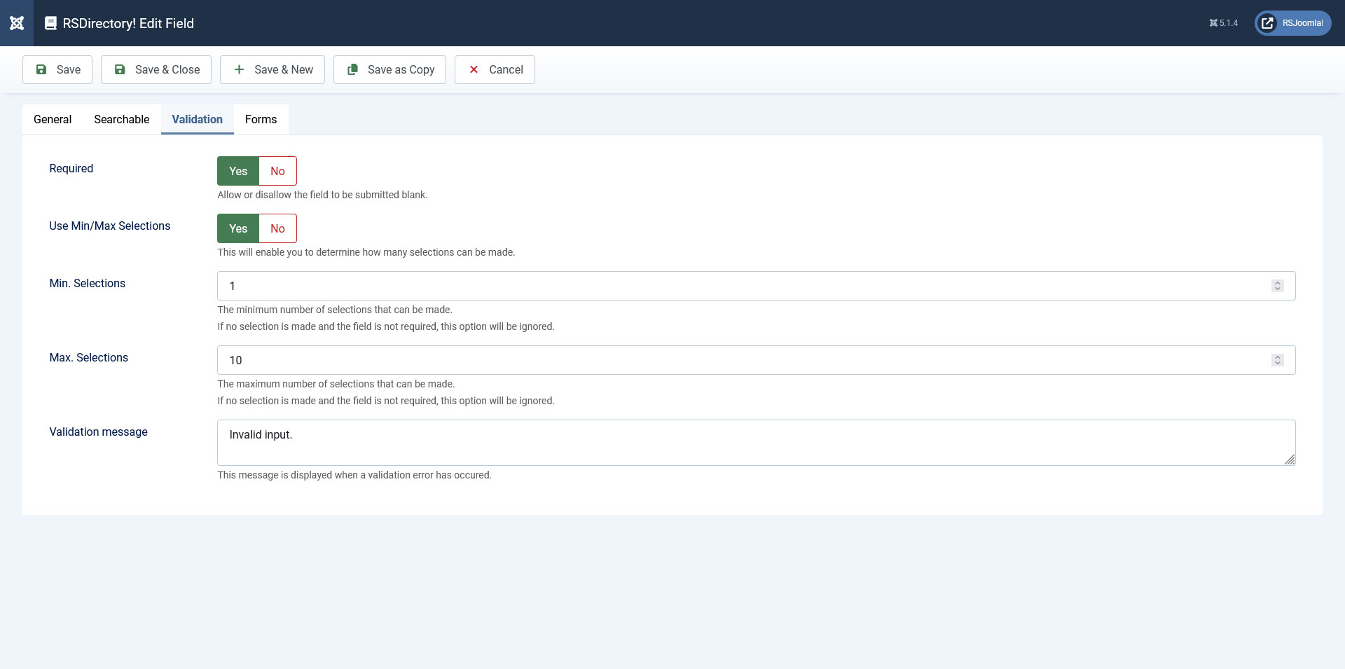
Validation
- Required: Set whether the field is required or not.
- Use Min/Max Selections: Yes / No - This will enable you to determine how many selections can be made.
- Min Selections: The minimum number of selections that can be made. If no selection is made and the field is not required, this option will be ignored.
- Max Selections: The maximum number of selections that can be made.
If no selection is made and the field is not required, this option will be ignored. - Validation message: This message is displayed when a validation error has occured.
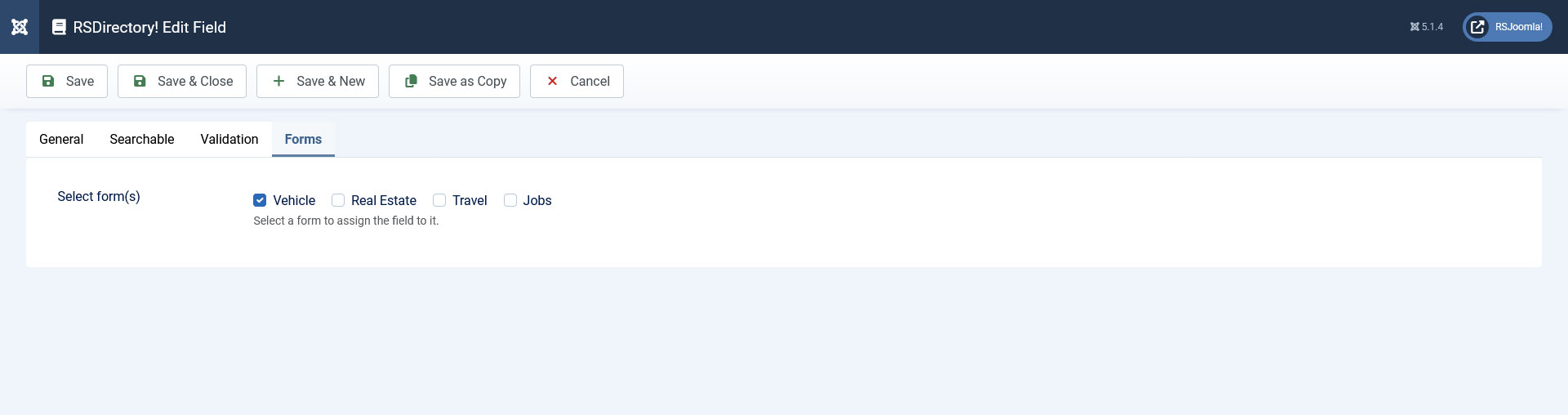
Forms
A simple layout containing a checkbox group whose items are consisted of all available forms. You can simply check which forms you want to have the field assigned to.
- Select form(s): Select the form(s) that you want to associate the field with